A phased testing approach that increased sales by 6% while repositioning TPT’s entire platform
I led the design and testing strategy for rolling out TPT’s rebrand across our highest-traffic surfaces—the homepage and global navigation. Working as both strategic lead and hands-on designer, I navigated significant organizational risk aversion by designing a phased testing approach that protected revenue while proving the rebrand’s business value. The result: 17% increase in search engagement, 6% lift in sales, and substantial traffic to new product offerings.
Timeline: 6 months | Role: Design Lead (Player-Coach)
The Challenge
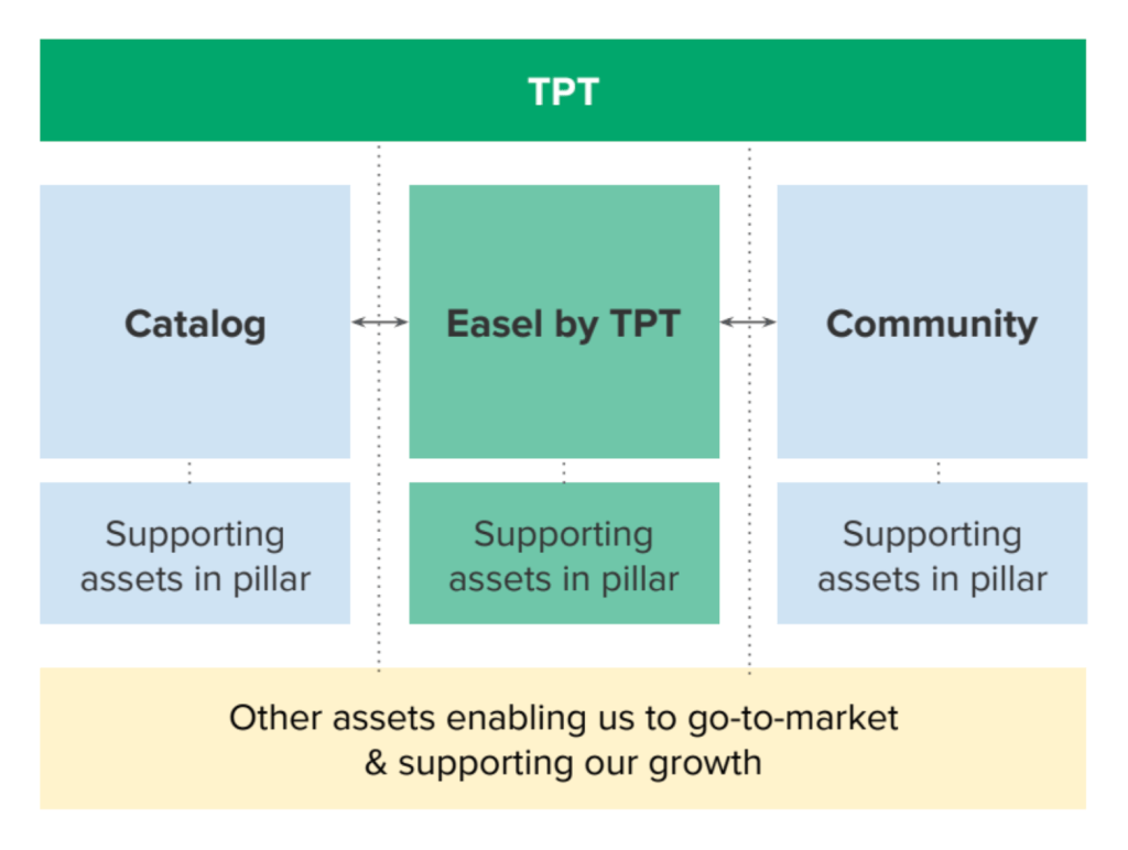
The rebrand repositioned TPT from a marketplace for printable PDFs to a comprehensive platform for teachers featuring our marketplace alongside Easel (digital authoring tools) and Community (professional development). We also introduced School Access, allowing districts to license the platform for all their teachers.
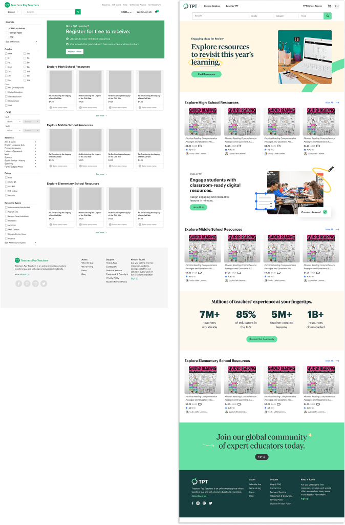
But we had a problem: our homepage and navigation still reflected the old TPT. The homepage was a search results page with an overwhelming left sidebar of filters. The navigation had no room for new offerings. And everyone was terrified that changing these high-traffic surfaces would crater our GMV.
What made this particularly challenging:
- The homepage and nav were revenue-critical surfaces with enormous traffic
- We had no precedent for A/B testing significant changes to these areas
- Stakeholders had deep anxiety about anything that might affect sales
- We needed to educate users about new offerings while protecting existing revenue streams
- The technical infrastructure (especially filters) was creating SEO problems
What was at stake: If we rolled out too fast and sales dropped, we’d lose executive trust and momentum for the entire rebrand. If we moved too slowly, we’d miss the window to reposition the brand and capture market opportunity.
My Role + Approach
I wore two hats on this project: setting the strategic direction for de-risking the rollout and designing the actual interface updates.
As strategic lead, I:
- Defined the phased testing strategy that became our roadmap
- Partnered with the Senior PM on Marketplace to scope each test based on technical constraints and business risk tolerance
- Coordinated with third-party engineering teams and SEO vendors to build and implement tests
- Translated competitive research insights into specific design decisions
- Created alignment across design, product, editorial, and executive stakeholders
- Coached other designers on the team about balancing business metrics with design vision
As IC designer, I:
- Designed every iteration of both the homepage and global navigation
- Made detailed decisions about information architecture, visual hierarchy, and interaction patterns (including things like hover vs. click behavior for menus)
- Conducted extensive QA on third-party engineering implementations alongside the PM
- Analyzed user behavior data to hypothesize improvements
- Packaged test results for stakeholder presentations
The reinforcement: My leadership context helped me design with business constraints in mind. I was implementing a redesign visually, yes, but also, and more critically, designing for testability and measurable outcomes. Staying hands-on meant I could move fast and ensure design quality at the detailed level.
The Process
Research & Competitive Analysis
During the broader rebrand work, we studied competitor platforms and identified key patterns:
- A growing preference for search and filtering located in the global navigation rather than page sidebars supported our desire for SEO to land people deep into the site
- Editorial voice and curated content on homepages, rather than pure search results
- Click-based menus as the standard interaction pattern (with some strategic use of hover for discovery)
These insights shaped our hypothesis: users would respond well to removing homepage filters in favor of navigation-based search. They would engage with editorial content that educated them about the platform.
Strategy: Test in Phases, Build Confidence Incrementally
Working with the Senior PM on Marketplace, I designed a testing approach that isolated variables and built organizational confidence. A critical unlock was partnering with a third-party dev team that could build redesigned pages and swap them via JavaScript for targeted cohorts. This meant we could test without tying up in-house engineering resources before we had directional results.
Homepage Tests:
- Remove filters (address technical debt, measure impact on sales)
- Introduce editorial modules (test rebrand visual direction)
- Full redesign with logged-in/logged-out personalization
Global Nav Tests:
- New architecture reflecting brand pillars
- Enhanced functionality (search, menus, SEO deep links)
Each test ran with a cohort tracked over 30 days, measuring GMV, traffic to new destinations, and search engagement.
Design Decisions
Homepage: The old homepage was a paradox. Power users loved it, but it overwhelmed everyone else. The filter sidebar created decision paralysis and caused massive load times, hurting SEO.
I designed the new homepage to serve multiple goals:
- For browsers: Full-width editorial modules showcasing curated resources and educating about new offerings
- For searchers: Prominent search bar with inline filters (grade, subject, price)
- For logged-in users: Personalized modules based on saved content and past behavior
- For SEO: Fast load times, rich content beyond just product listings
The key insight: we didn’t need filters on the homepage because users searching for something specific would use search, and browsers benefited more from editorial curation.
Global Navigation: The navigation needed to accomplish several things simultaneously:
- Represent the new brand architecture (Catalog, Easel, School Access as equal pillars)
- Improve SEO through deep links
- Modernize outdated UI patterns
- Educate users about new offerings
I redesigned the structure to feature:
- Catalog (formerly Marketplace) with sections for grades, subjects, resource types—both for SEO and user education
- Easel menu with educational content about the product
- School Access menu with lead generation forms for district contacts
- Expanded search with inline filters
- Reorganized the user menu and cart with a cleaner information architecture
The menus served dual purposes: functional navigation and in-context education about the platform.
The Unglamorous Details That Mattered
Hover vs. Click: We agonized over interaction patterns for the navigation menus. Hover menus flickered, confusing users, while click-based menus were becoming the standard across competitor sites. We landed on click for most menus, but intentionally kept School Access on hover for discoverability, since it was the most critical conversion goal, and we wanted users to stumble upon it even if they weren’t actively looking.
QA on Third-Party Implementations: The third-party dev team built elaborate tests that required extensive quality assurance. The PM and I spent significant time testing edge cases, browser compatibility, and ensuring the JavaScript swaps didn’t break existing functionality.
Data Analysis & Stakeholder Communication: Tracking cohorts over 30 days, analyzing behavioral data, and packaging results for executives was its own discipline. Each test needed clear success criteria defined upfront and compelling storytelling afterward to maintain momentum.
The Solution
Homepage Evolution
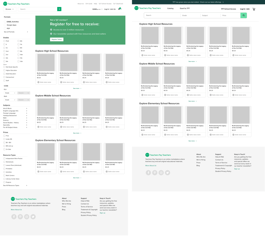
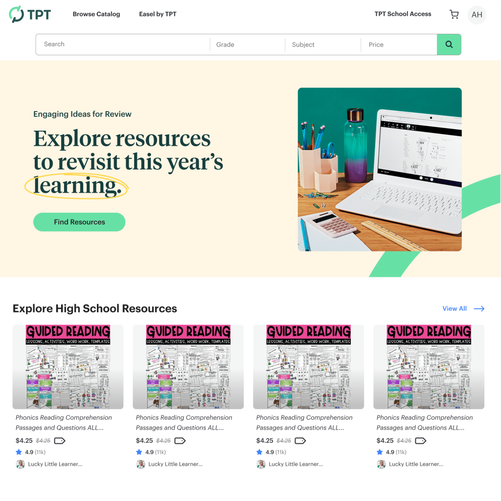
Test 1: Remove Page Filters, Update global nav search
This addressed both a user experience and a technical problem. Result: no negative impact on sales, significant improvement in page load time.
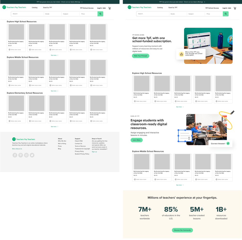
Test 2: Editorial Modules
Introduced the rebrand’s visual direction through full-width modules—result: maintained sales metrics while driving traffic to linked destinations.
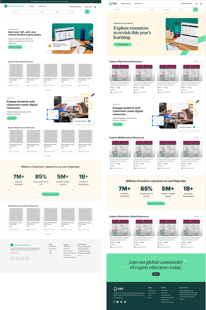
Test 3: Full Redesign
The complete vision with personalization and comprehensive editorial content. Result: continued sales stability with increased engagement across the platform.
Global Navigation Redesign

The new navigation featured enhanced menus for each brand pillar, prominent search with filters, and modernized UI patterns.
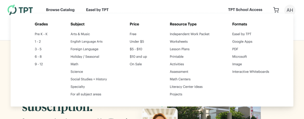
Catalog dropdown with grades, subjects, price ranges, resource types, formats
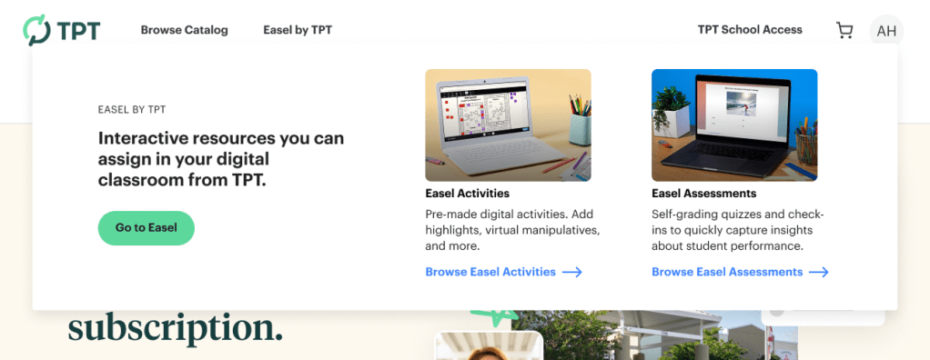
Easel educational menu

School Access lead generation menu

Updated cart menu
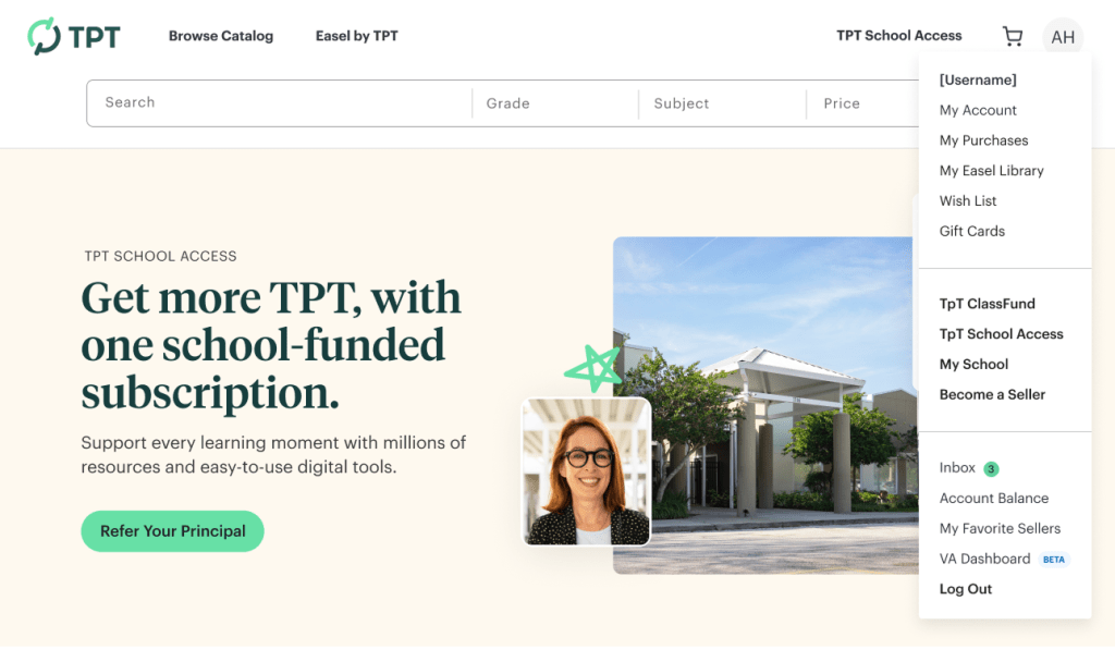
Reorganized user menu
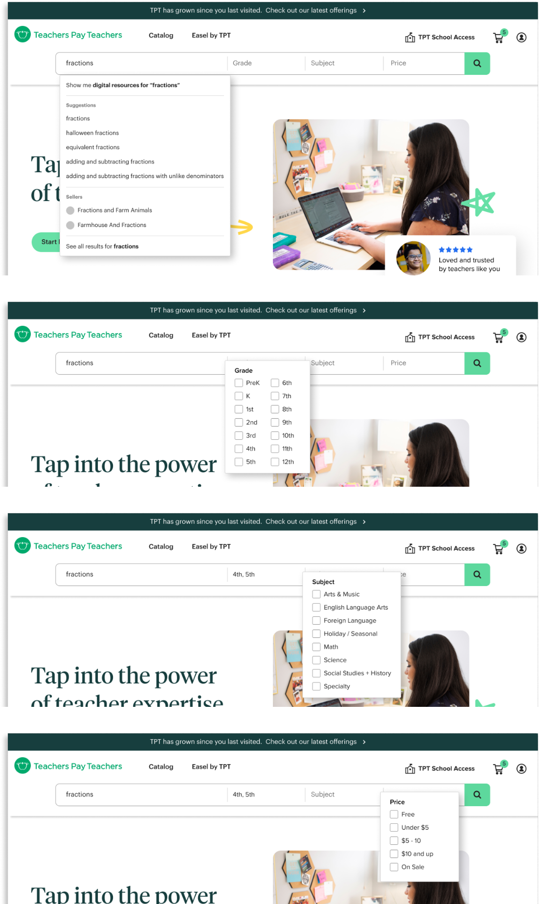
Enhanced search bar with filters
Impact & Results
Quantitative Results
- 6% lift in sales for the cohort with the new global navigation
- 17% increase in search usage through the navigation
- Substantial traffic increases to Easel and School Access destinations
- Zero negative impact on GMV across all homepage tests
- Significant improvement in homepage load time and SEO performance
Qualitative Results
The phased approach transformed stakeholder perception. Each successful test built confidence in both the rebrand and our ability to make significant changes without damaging the business. By the final rollout, executives were asking, “What’s next?” rather than “Are you sure about this?”
Organizational Impact
This project established a precedent for how TPT approaches high-stakes changes. The testing methodology became a template for future platform updates. More importantly, it proved the rebrand was a business driver, not just a cosmetic exercise.
My Specific Contribution
The phased testing strategy was the unlock. Without it, we would have faced a binary choice: roll out everything and hope for the best, or stay frozen in fear of negative metrics. By designing tests that isolated variables and built incremental proof, I created a path forward that protected the business while enabling transformation.
Reflections & Learnings
What surprised me: How much organizational anxiety could be managed through smart scoping. Each test wasn’t just measuring user behavior; it was building internal confidence. I also didn’t anticipate how much the partnership with third-party vendors would enable us to move fast. Having a dev team that could implement tests without touching production code was a game-changer.
What I learned:
- Breaking down complexity: I learned how to break a massive, high-stakes project into testable steps. The skill wasn’t just in designing the interfaces; it was in creating the sequence of work itself.
- Data-driven hypothesis: I developed my ability to analyze user behavior patterns and form hypotheses about what would benefit both users and business metrics. It used data to inform design thinking.
- Vendor collaboration: Working with SEO agencies and third-party engineering teams taught me how to communicate design intent clearly, QA work I didn’t build myself, and maintain quality standards across distributed teams.
- Storytelling with data: Packaging test results for stakeholders became its own craft. I learned to define success criteria upfront, track the right metrics, and present findings in ways that built momentum for the next phase.
What I’d do differently: While I was rigorous about tracking revenue metrics, I would have also established clear metrics for performance improvements and technical debt relief. Page load time and SEO gains mattered enormously, but I didn’t package those wins as compellingly as the sales data. Showing the full picture of impact—not just business metrics but also platform health—would have made an even stronger case for the work.
The bigger picture: This project fundamentally changed how I think about design leadership. It’s not just about craft or vision—it’s about creating the conditions that allow change to happen. Sometimes the most crucial design decision is how you sequence the work, not just what the work looks like. The player-coach approach was essential: I needed strategic thinking to design the testing plan, and hands-on execution to move fast and maintain quality. Neither mode alone would have worked.
You must be logged in to post a comment.