
Modernizing the experience, increasing conversion, and turning signup into a source of user insight
At Teachers Pay Teachers, I led the redesign of our login and registration experience—one of the oldest, most outdated parts of our product—resulting in a 22% increase in completed registrations and transforming signup into a strategic source of user intelligence.
Role: Product Design Manager
Company: Teachers Pay Teachers
Product: Marketplace
Teams: Product, Engineering, User Behavior Research
The Challenge
The login and registration flow at Teachers Pay Teachers had become a liability. Visually outdated and misaligned with our new brand, it undermined trust at a critical moment. Functionally, it was a missed opportunity: we were onboarding thousands of new teachers without gaining sufficient insight into them to personalize their experience or inform internal strategy. Built on legacy code with significant technical debt, it had been deprioritized from the roadmap, landing in backlog purgatory despite being the first impression for new users following increased marketing investment.
Goals
- Modernize login and registration to align with the updated TPT brand and improve trust.
- Collect high-value user metadata at signup without harming conversion
- Increase registration completion through thoughtful UX experimentation
- Support personalization and internal decision-making with more reliable user data
My Role + Approach
As Product Design Manager, my role was to trust my designer’s instincts and help prioritize the work they knew needed to be done.
The designer who owned Marketplace had long wanted to redesign this flow, but could never get it prioritized. The visual problems were obvious, but the engineering lift was substantial due to technical debt, and a purely aesthetic refresh wasn’t compelling enough to leadership. I worked closely with this designer to reframe the opportunity, positioning it as a way to capture strategic user metadata to drive personalization, inform marketplace strategy, and protect our growing marketing investment.
Throughout the rebrand work at TPT, we developed a strong belief in testing our way to improvements. The business case was compelling enough to secure resources for a test, even if full implementation wasn’t yet guaranteed. I partnered with the designer to develop the test strategy, helped them choose the different versions we’d run, and worked with our PM and User Research team to ground our hypothesis in behavioral science.
This project reinforced a core belief about design leadership: your job isn’t always to design the solution yourself. Sometimes the most impactful thing you can do is listen to your designers, help them build a compelling business case, and create the conditions for their work to get built.
How We Got the Test Prioritized
This area of the product had become outdated for reasons not immediately visible to users, but the underlying issues ran deep. The flow was built on legacy code with significant technical debt, so a purely visual refresh wasn’t sufficient to justify the engineering investment required. While the broader rebrand helped create momentum to update surfaces across the product, it still wasn’t enough on its own to move this work to the top of the roadmap.
What ultimately unlocked prioritization was reframing the problem in terms of business impact and growth timing. We were investing heavily in marketing to attract new users to a more modern, digital-first version of TPT. Yet the first experience many of those users had felt visually outdated and inconsistent with that promise. Beyond the brand mismatch, we also missed a critical opportunity to learn who this influx of new users was. By positioning signup as a moment to collect high-value metadata—information that could power personalization, guide marketplace supply, and inform product strategy—we aligned design, product, engineering, and leadership around the value of the work.
The business case was strong enough to warrant a test. Once we ran it and saw the results, it became clear that our instincts were right: this was a significant area for improvement.
The results were impressive: a 22% increase in completed registrations for the multi-step flow and a 12% increase from the login page redesign alone. Those numbers made the decision obvious and got the project the complete prioritization it deserved for launch.
The Strategy: Metadata Matters
Teachers don’t experience TPT generically; they experience it through the lens of their classroom.
If you teach 3rd-grade math, seeing middle-school history resources on the first entry isn’t just irrelevant; it’s distracting and creates the sense that TPT doesn’t have what you need. By capturing grade and subject taught during signup, we could customize default search results, surface relevant content immediately, and reduce time-to-value for new users.
But this information was just as important internally.
At the time, we believed our user base skewed heavily toward elementary STEM teachers, primarily based on search trends and marketplace activity. As the platform grew, those inferred signals became increasingly noisy. Trending searches told us what people were looking for, not necessarily who they were.
Collecting this information directly from users enabled us to build a more accurate understanding of our audience, better guide content creation by seller-authors, and make product and marketplace decisions with greater confidence.
This wasn’t just about personalization; it was about shifting from assumption to user-supplied truth.
The Solution: Experiment Design
We know from behavioral research that people value things more after they’ve invested effort (the IKEA Effect). Our hypothesis: if users start with easy, low-effort decisions, they will feel invested and be more likely to complete registration.
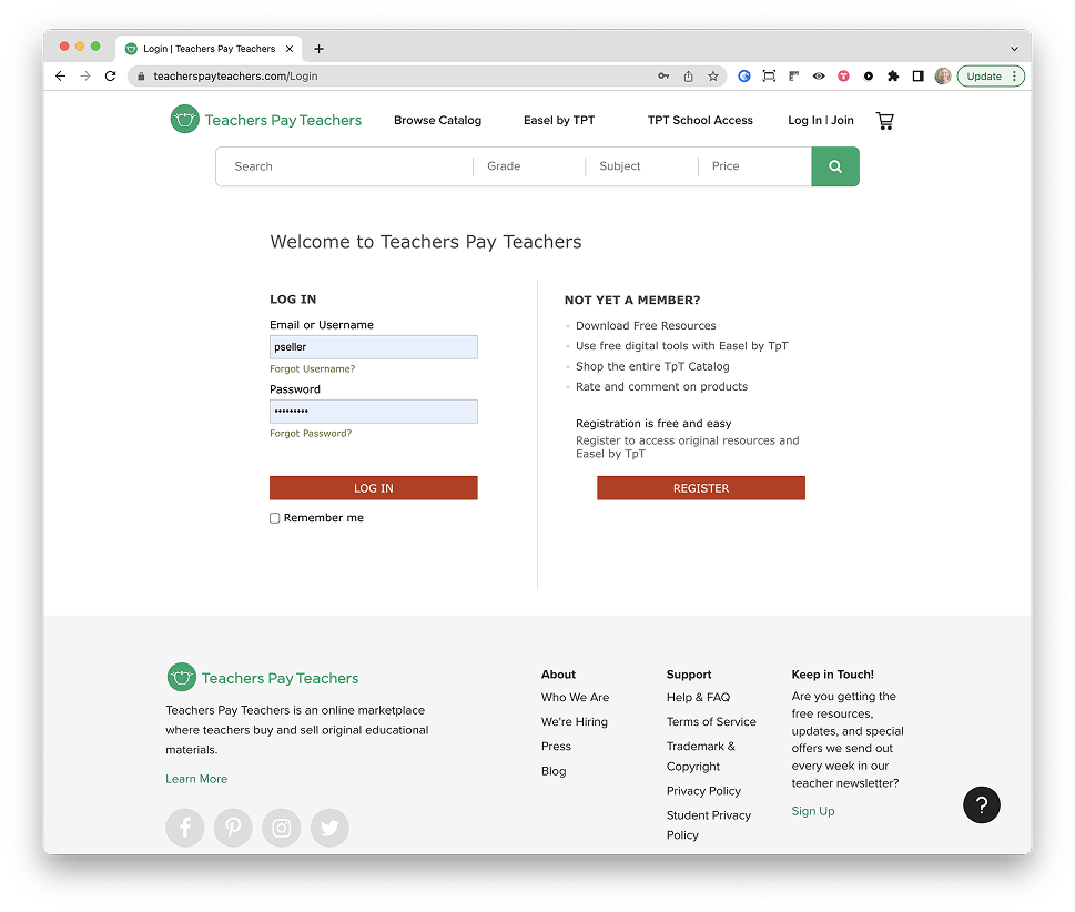
Version A: Single-Page Signup (Control)
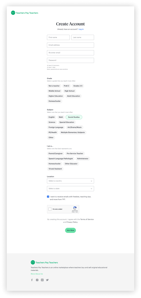
The control experience collected all required information—grade, subject, and account details—on a single page. It was familiar and efficient on paper, but our concern was that it felt visually dense and asked too much, too quickly, resulting in high abandonment.
Version B: Multi-Step Signup Flow (Test)
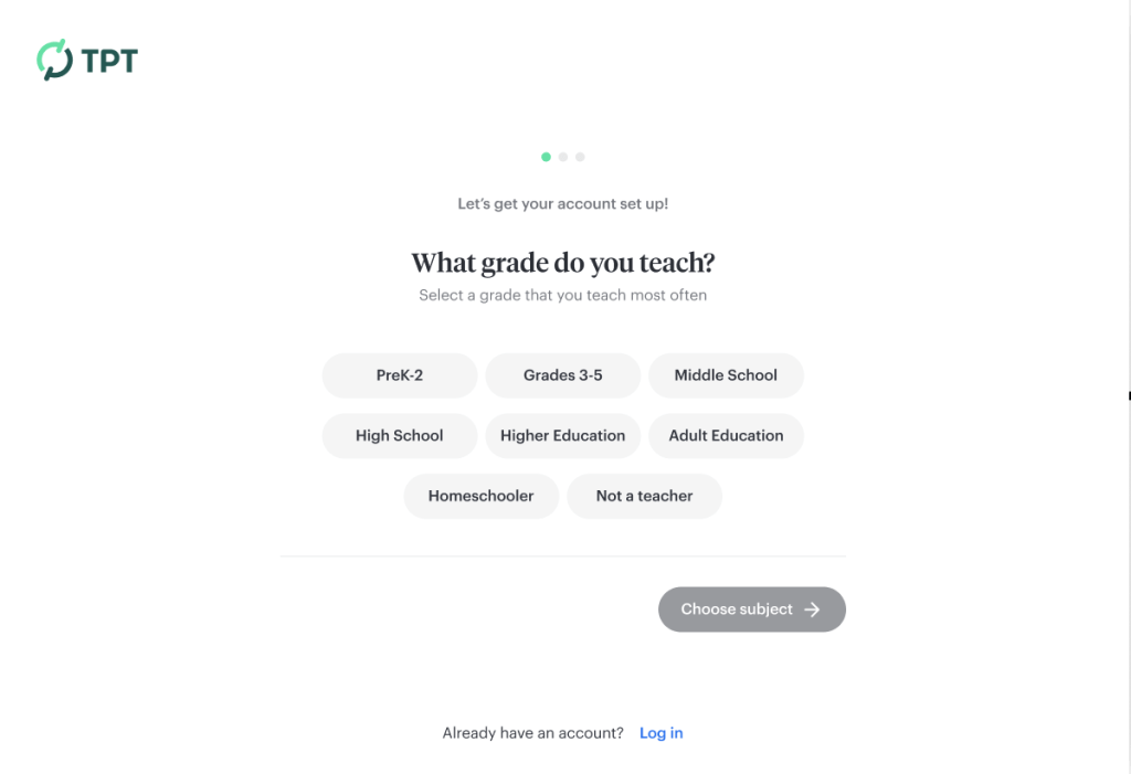
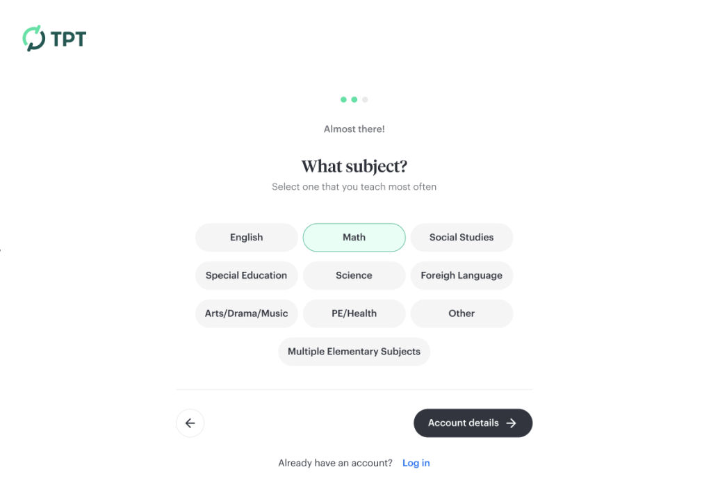
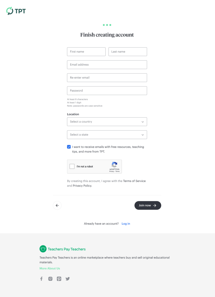
The test experience splits the signup into three lightweight steps: grade taught, subject taught, and account details.
We ordered the steps intentionally. Grade and subject are quick, intuitive choices that require no typing. By the time users reached the account form, they had already invested time and attention. The goal was to build momentum and motivate the user to complete the registration process.
We knew this would be a larger engineering effort to split the work into multiple pages, but we felt strongly that it would deliver a better user experience. Something we could prove in an A/B test.
Updating the Login Page
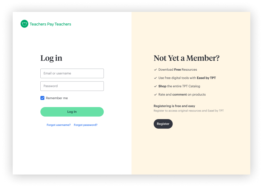
In parallel, the designer redesigned the main login page to reflect the updated TPT brand: cleaner typography, a warmer, more confident visual language, and a clearer hierarchy and calls to action. This page used a navigation-free header we’d developed for the cart-to-checkout flow to minimize distractions and enable the user to focus on a single goal.
Even without changing the underlying flow, this visual refresh alone produced measurable results.
Results
+22% increase in completed registrations. The multi-step signup flow outperformed the single-page control. A significant increase to warrant the extra engineering work.
+12% increase in registrations. Achieved through visual and structural updates to the login page alone.
After the test showed excellent results, the rollout continued to yield significant wins:
- Improved first-use personalization. New users immediately saw more relevant content based on grade and subject.
- Higher-quality user intelligence. Shifted internal decision-making from inferred signals to self-reported data.
What Made This Successful
These results proved what the designer had known all along: this work mattered. My contribution was to translate their design instinct into a business case to secure testing resources, and then let the data speak for itself. The stupendous results—numbers that made leadership sit up and take notice—turned a long-stalled request into a strategic priority.
This is what player-coach leadership looks like in practice: not always designing the solution yourself, but using your position to advocate for your team’s best ideas, remove obstacles, and create the conditions for great work to get built.
Internal Impact
Product & Strategy Alignment
Self-reported user data enabled the product, design, and leadership teams to align more quickly on priorities. Instead of debating assumptions, we could point to real distributions and make clearer tradeoffs.
Marketplace Supply & Seller Guidance
Grade and subject insights helped identify gaps between supply and demand, recommend high-impact content opportunities to seller-authors, and support healthier category growth over time. Search trends showed what was popular. Metadata showed what was missing.
Organizational Confidence at Scale
As TPT grew, this project helped establish a more durable source of truth that informed planning across product, content, marketing, and partnerships.
What I Learned
This project taught me that design leadership isn’t always about having the best design ideas; it’s about recognizing them in others and clearing the path for those ideas to get built. The designer on my team had been right all along about the importance of this work. My job was to trust their instincts and help them make the case that would finally get it prioritized.
I also learned the power of testing as a forcing function. By reframing a “should we do this?” conversation into a “let’s test it” conversation, we reduced risk and let data drive the decision. The 22% improvement validated the designer’s judgment and gave the team confidence to tackle the project despite tech debt.
If I were to continue this work, I’d expand the metadata we collect during registration and explore how we use it to further improve the first-session experience. Can we create feedback loops in which new user data informs marketplace recommendations in real time? How might we use this intelligence to dynamically surface content gaps and marketplace opportunities?
Design as Business Intelligence
This project reinforced a principle that shaped much of my later work at TPT: design isn’t just about improving experiences; it’s often the most effective way to help an organization understand its users at scale. By combining user value with business insights, we improved conversion rates and provided the company with better data to grow responsibly. And by trusting designers’ instincts and helping them advocate for their work, we built a culture where the best ideas got prioritized regardless of difficulty.

You must be logged in to post a comment.