
Using teacher research to redefine an MVP
Role: Product Designer
Company: Teachers Pay Teachers
Product: Easel
Teams: Product, Engineering, UXR, Educational Research
When Teachers Pay Teachers explored building a new graded product within Easel, we initially referred to the work internally as “Quizzes.” Early teacher research revealed that while grading mattered, the quiz mental model was too narrow for how teachers actually assess learning in real classrooms. By using research to pressure-test assumptions early, we reframed the MVP from a rigid quiz tool into a flexible assessment system, reducing adoption risk and creating a product that is resilient to real-world classroom variability.
Key takeaway: MVPs shouldn’t just test features. They should test whether you’re solving the right problem.
Context & Problem
Teachers Pay Teachers serves a wide range of educators who work under significant time pressure, emotional strain, and institutional constraints. As part of Easel’s expansion, we explored a new product area focused on graded student work.
Internally, we referred to this initiative as Quizzes. At the time, this was a reasonable working assumption:
- We already had a product called Activities, which functioned as a digital and interactive version of the printable PDFs teachers had come to rely on
- We knew this next product would involve grading and evaluation
- “Quizzes” helped distinguish the work internally and move discovery forward
However, the term had not yet been validated with teachers, and the risk was that we might prematurely constrain the product based on an internal label rather than real classroom needs.
Core question: Are we building a quiz tool—or are we trying to support assessment more broadly?
What We Almost Built (And Why It Wouldn’t Have Worked)
Early in the discovery phase, I created wireframes that reflected our initial “Quiz” assumption. The authoring experience was optimized for:
- Single correct answers
- Traditional question formats (primarily multiple choice)
- A linear, one-and-done completion model
When we tested these wireframes with teachers, the feedback was consistent: this feels too rigid.
Teachers described scenarios where:
- They wanted students to reflect on emotional responses without being judged as right or wrong
- They needed students to retake assessments multiple times until they understood the material
- They were assessing comprehension in ways that didn’t fit neatly into multiple-choice
The wireframes weren’t wrong; they were just too rigid.
If we’d shipped that version, we likely would have seen:
- Lower adoption among teachers who needed flexibility
- Immediate requests for “non-graded quiz” workarounds
- A product that felt disconnected from how assessment actually happens in classrooms
We knew we usually had only one chance to make a first impression. Teachers wouldn’t always try a product a second time if it didn’t meet their needs right from the start. Even though this was an MVP, it had to have clear value and represent how teachers’ mental models worked in the classroom.
What We Learned
I partnered closely with UXR and the educational research team to conduct teacher interviews and early discovery across grade levels and subject areas. Surprisingly, the research consistently challenged our framing.
Language shapes behavior
While “Quizzes” worked as internal shorthand, teachers described “Assessments” as a broader, more flexible practice that better represented how they think about testing. The quiz mental model often implied finality and pass/fail judgment, which didn’t reflect day-to-day teaching.
Assessment isn’t always binary.
Teachers emphasized the need for emotional and reflective learning alongside correctness. Some learning moments were about expression and understanding, not right vs. wrong answers.
Learning is iterative, not final.
Teachers wanted students to be able to retake assessments multiple times until they understood the material. Assessment functioned as a feedback loop, not a gate.
Classroom contexts vary widely.
A single interaction model—such as multiple-choice—couldn’t accommodate the diversity of classroom needs across subjects, ages, and teaching styles.
The research was telling us where our assumptions broke down. Now we had to apply that learning to our MVP.
Assumptions → Evidence → Decision

Caption: Early assumptions framed the product as a traditional quiz. Teacher research revealed that assessment is iterative, emotional, and context-dependent—leading to a reframed MVP focused on flexibility rather than rigid correctness.
Redefining the MVP
Rather than optimizing a quiz experience, we made a deliberate shift:
From: A narrowly defined, correctness-driven quiz tool
To: A flexible assessment system that teachers could adapt to their classroom context
This decision intentionally traded specificity for flexibility. It allowed teachers to use the product in ways we couldn’t fully predict at first, while still maintaining clarity and structure.
How Cross-Functional Collaboration Shaped the Product
The shift from “Quizzes” to “Assessments” wasn’t immediate. It required alignment across the team:
With the PM, we had to renegotiate the scope. What we thought was a straightforward quiz feature became a more nuanced product with implications for how we talked about it, what question types we’d support, and how we’d prioritize future work. I wrote user stories to define the new MVP and worked with the PM to determine what to launch first and what to leave for later.
In UXR and educational research, we worked closely to translate their findings into design decisions until the teacher experts (and the teachers we showed early designs to) agreed that this product reflected how their classroom teaching practices worked.
In engineering, the flexible question-type model had technical implications. We worked together to prioritize what was feasible for a first launch (multiple choice, true/false, emotional intelligence with no wrong answers) while setting up the architecture to support more complex types later (short passage, audio). Understanding technical constraints and timelines helped shape which features made it into the initial release.
The key part of this stage wasn’t just the design; it was getting everyone aligned around launching something different but more set up for success.
Design Approach
With the new framing in place, the design focus shifted to enabling flexibility without sacrificing clarity.
Guiding Principles
- Support multiple learning modes beyond right/wrong answers
- Design for iteration rather than one-and-done completion
- Let structure guide teacher workflows without constraining them
Expanding the Model: Supporting Real Assessment Practices
As research reshaped our understanding, I adapted the existing Activities UI to create an authoring surface that supported a broader range of assessment behaviors.
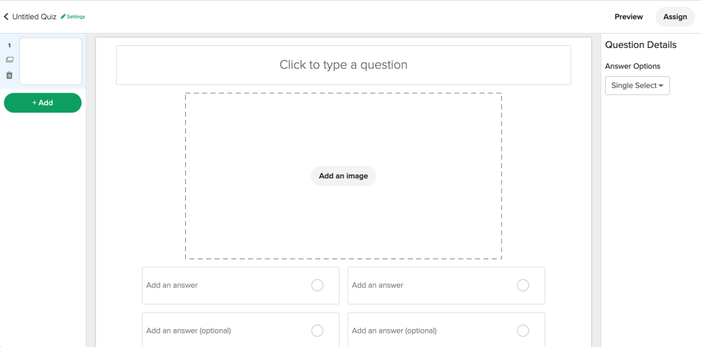
Flexible Question Types
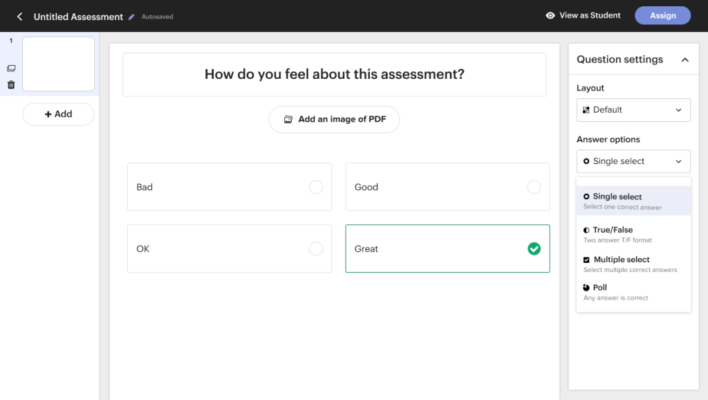
Supporting multiple question types allowed teachers to assess understanding, reflection, and emotional learning—not just correctness.
Designing for Iteration: Retakes as Learning
A key insight from research was that assessment is iterative.
Teachers wanted students to:
- Try again
- Learn from mistakes
- Progress toward understanding rather than failing once and moving on
This reframed assessment from a gate into a feedback loop.
Teacher View: Understanding Results at a Glance
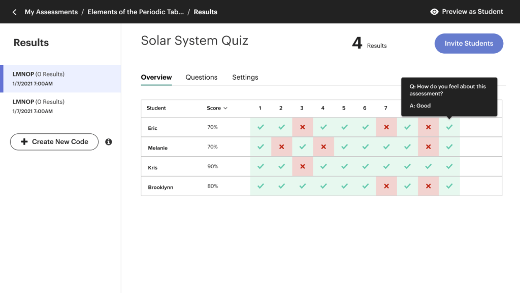

Teachers needed clarity without being overwhelmed—quick insight into class performance, with the ability to drill into individual questions when needed.
Student View: Completing an Assessment

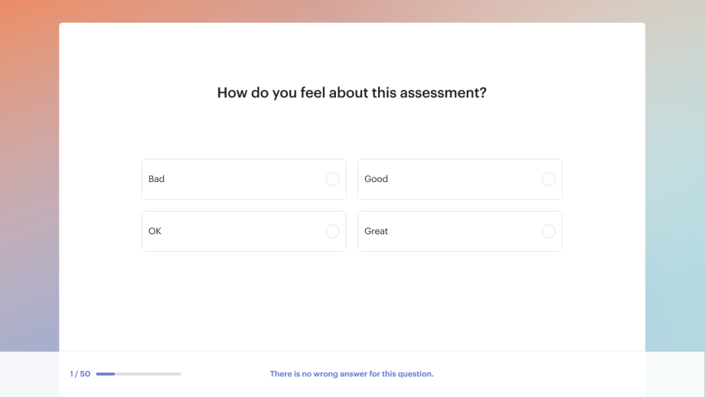
The student experience emphasized clarity and approachability, reinforcing the view of assessment as part of learning rather than a high-stakes moment.
Outcome & Impact
The reframed product launched successfully and became a significant part of the Easel ecosystem:
Adoption & Usage
- 33% of Easel products in the marketplace became Assessments—indicating strong teacher adoption despite being a first-time product launch
- 67% of teachers used emotional intelligence questions (questions with no right/wrong answers)—validating our hypothesis that assessment needed to go beyond traditional correctness models
Product Evolution
The flexible foundation we built enabled continued growth:
- A dedicated designer was hired to own and evolve the product
- New features like dashboard enhancements and student view improvements were built on the assessment framework
- The product scaled to support short passage comprehension and audio-based questions
What Made It Work
By testing assumptions early through research, we avoided locking ourselves into a narrow quiz model. The result was a product resilient enough to support diverse classroom needs—from traditional multiple choice to reflective, emotional learning—without requiring a complete rebuild.
What I Learned
This project reinforced several principles that now guide my work:
Assumptions are necessary—but temporary
Internal shorthand helps teams move forward, but it needs to be validated with users before it becomes product direction.
Language is part of UX and directly affects adoption.
Calling something a “quiz” versus an “assessment” wasn’t just semantics—it shaped how teachers understood the product’s purpose and flexibility.
Emotional safety matters in high-stakes environments
Design decisions like allowing “no wrong answer” questions and supporting retakes weren’t just features—they reduced anxiety and made the product feel more human.
MVPs are about risk reduction, not speed theater.
Taking time to test wireframes and terminology early prevented us from building the wrong thing fast.
Research should be allowed to change direction, not just validate a decision.
The most valuable research doesn’t confirm what you already believe—it shows you where you’re wrong.
These lessons have since shaped how I approach onboarding, workflows, and systems in other trust-heavy products.
Why This Matters
Whether designing for teachers, caregivers, or people navigating health-related decisions, the pattern is consistent:
When users are under pressure, clarity and flexibility matter more than cleverness.
Design’s role is not to impose structure—it’s to create space for people to do their best work.

You must be logged in to post a comment.