
From marketplace add-on to standalone product with 10x adoption in 8 months
Role: Product Designer
Company: Teachers Pay Teachers
Product: Easel (New Product Launch)
Team (other than me): Senior Designer (authoring tool), Product, Engineering, Marketing, Brand, UXR
Timeline: [Launch + first 8 months]
Teachers Pay Teachers built its reputation as a marketplace for downloadable, printable teaching materials. When the company decided to launch Easel—a digital authoring tool—the challenge wasn’t just designing the tool itself. It was figuring out how to launch something fundamentally different (a tool for creating interactive activities) inside a product environment known for selling resources (PDFs and printables).
I worked alongside a senior designer who owned the authoring tool interface. My focus was on the broader launch challenge: how do we position Easel so it makes sense to both sellers and teachers? How do we educate users about this new thing? How do we design the systems around the tool—the dashboard, onboarding, and marketplace integration—to give Easel a fighting chance of adoption?
Launching a Tool in a Marketplace of Printable Resources
Teachers Pay Teachers was a marketplace where educators bought printable resources, such as PDFs, worksheets, and lesson plans. You searched, you purchased, you downloaded. Simple.
Easel was fundamentally different. It was a tool—a way for teachers to create interactive digital activities. But it existed within TPT’s marketplace, which created unique design challenges.
The tension:
- TPT users expected to buy things to download, not build things for digital use
- Sellers created finished products, not templates for others to customize
- The entire product experience was optimized for discovery and download, not authoring and creation
How do you launch a tool inside a marketplace?
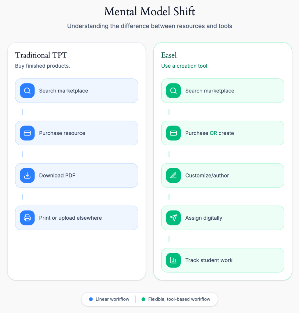
The fundamental challenge: TPT users understood “buy and download.” Easel required understanding “customize and create.” This wasn’t just a feature addition—it was a mental model shift that affected every design decision from onboarding to marketplace integration.
The Design Problem
This manifested in several interconnected challenges:
Identity Crisis
Easel didn’t have a name at launch. Without a clear identity, how could we explain what it was—or wasn’t? Was it a feature of TPT? A separate product? Something in between?
→See full case study: Naming and Branding Easel
Marketplace Confusion
Teachers were used to buying PDFs. Now they could buy “Easel-enabled resources”—but what did that mean? Could they customize them? Did they need to learn new software?
Sellers were used to uploading finished files. Now they needed to create interactive activities or convert their existing inventory. How do we make that transition clear?
→See complete case study: Positioning Easel in the Marketplace
Onboarding & Education
Teachers needed to understand four different workflows:
- Customizing purchased resources – How to modify Easel-enabled content they bought
- Using existing inventory – How to discover which of their already-owned resources were Easel-enabled
- Creating from scratch – How to use Easel as an authoring tool to build new activities
Each workflow required different education, different UI, and different mental models.
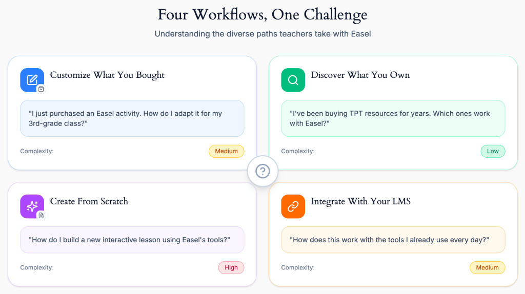
The onboarding challenge: teachers needed to understand which workflow applied to their situation—and we couldn’t overwhelm them by explaining all four at once. The dashboard, empty states, and progressive onboarding needed to surface the proper workflow at the right time.
What We Were Building
Easel wasn’t just one thing. It was a system of interconnected parts:
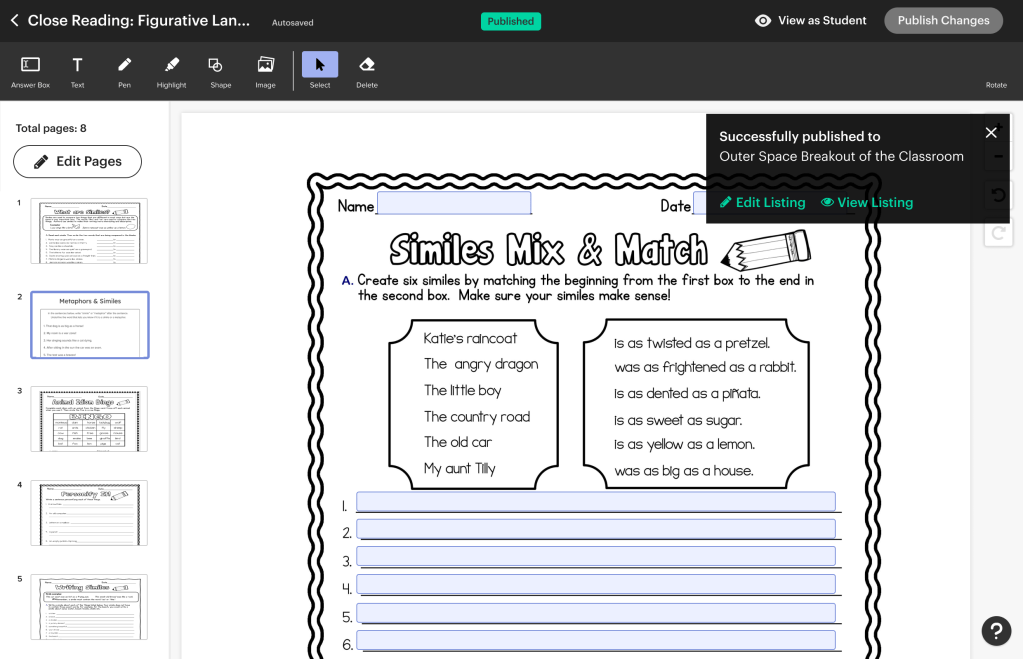
The authoring tool – A digital surface for creating interactive activities (initially built on top of existing PDFs, allowing teachers to add drag-and-drop, fillable fields, and other interactive elements)
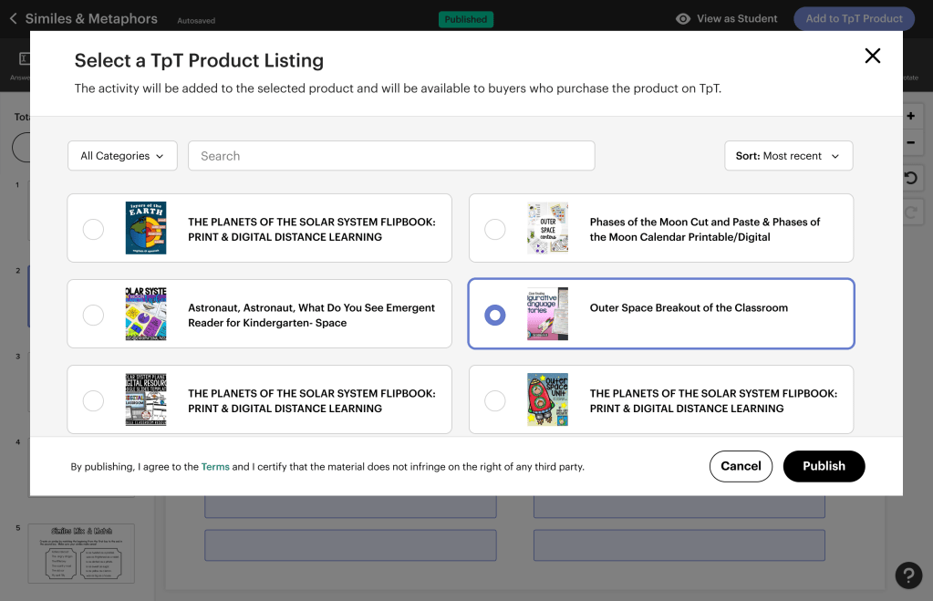
A conversion system – A temporary workflow for sellers to convert their existing PDF inventory into Easel-enabled resources
A new dashboard – A centralized place to see all your Easel resources (both created and purchased) and manage them
Marketplace integration – Visual indicators, filtering, and education to help teachers understand which products were Easel-compatible
My Role: Designing the Launch Strategy
I worked alongside a senior designer who had been working on the Activities product and was the natural owner of the authoring tool interface. She focused on the tool itself: the canvas, the interactive elements, the creation experience.
My role was everything around the tool: how we positioned it, how we educated users about it, how we integrated it into TPT’s ecosystem, and ultimately, how we gave it an identity that could succeed in the marketplace.
What I Owned
1. Brand Identity & Naming. At launch, Easel didn’t have a name. I led the process of defining the product, its name, and its visual differentiation from TPT while remaining connected to it.
→See full case study: Naming and Branding Easel
2. Onboarding & Education. Teachers needed to understand four different ways to use Easel:
- Customizing purchased Easel-enabled resources
- Discovering which resources they already owned that were Easel-compatible
- Creating new activities from scratch
- Integrating Easel with their existing LMS (like Google Classroom)
I designed the onboarding flows, tooltips, and educational content that introduced these workflows without overwhelming users.
3. Dashboard & Resource Management. Teachers needed a centralized place to view and manage all their Easel resources (both created and purchased). I designed this dashboard and its integration into TPT’s existing navigation.
4. Marketplace Integration & Positioning. How do we show teachers which products are Easel-enabled? How do we help sellers understand the value of creating Easel content? I designed the visual indicators and filtering systems and worked with marketing on positioning Easel in the marketplace.
→See full case study: Positioning Easel in the Marketplace
5. Post-Launch Evolution
After Easel launched with Activities, I continued designing new capabilities. The most significant was assessments—a project that started as “Quizzes” and evolved into a more flexible approach based on teacher research.
→See full case study: Reframing Quizzes as Assessments
How We Collaborated
While the senior designer owned the authoring tool, I partnered with her on feedback and strategic direction. She’d bring me in to review interaction patterns or discuss how authoring features would impact the broader launch strategy. I brought her into conversations about branding and positioning to ensure the tool’s design aligned with how we were talking about Easel externally.
The division of labor worked because:
- She had deep context on the authoring tool and could focus on making it excellent
- I could zoom out and focus on whether anyone would use it—and how they’d discover it
Solving the “Tool in a Marketplace” Problem
Phase 1: Establishing Identity (Post-Initial Launch)
Easel initially launched without a name. It was simply “the interactive activity tool” or “the digital authoring feature”—internal shorthand that didn’t translate to users.
This created immediate problems:
- Teachers couldn’t easily talk about it or search for it
- Marketing struggled to position it
- It felt like a feature, not a product
The Naming and Branding Process
I led a cross-functional effort to establish Easel’s identity. This wasn’t just about picking a name—it was about defining what the product stood for and how it would be positioned relative to TPT.
The work involved:
- Testing multiple names with teachers and sellers
- Developing visual identity guidelines
- Creating brand positioning that could guide future product decisions
→ For the full story of how “Easel” emerged as the winner and how we developed its visual language, see the Naming and Branding Easel case study.
Why this mattered for the product: Once Easel had a name and visual identity, we could redesign the marketplace integration, onboarding, and dashboard to reinforce that identity. It gave us a North Star for design decisions.
Phase 2: Designing Onboarding & Education Systems for Sellers
Dashboard as Education
The Easel dashboard wasn’t just a resource management tool—it was an educational tool. I designed it to surface the four workflows contextually:
- “You have 5 Easel-enabled resources ready to customize” → prompts exploration
- “You have 10 existing resources ready to convert to digital activities” → prompts action
- “Create a new activity from scratch” → clear entry point for authoring

Phase 3: Marketplace Integration & Positioning
Easel’s success didn’t just depend on good product design—it depended on whether teachers and sellers could understand what it was when they encountered it in the marketplace.
This was a design problem as much as a marketing problem.
How do we make “Easel-enabled” resources visually distinct?
I designed visual indicators (badges, labels, filters) that clearly distinguished interactive from static PDFs.

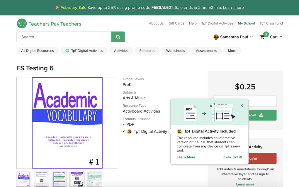
The marketplace integration challenge: making Easel-enabled resources discoverable without overwhelming the existing experience. Visual indicators, filtering, and hierarchy let teachers find interactive content while preserving the familiar marketplace layout.
How do we help sellers see the value of creating Easel content?
I worked with the product and marketing teams to shape messaging around increased engagement, higher ratings, and marketplace visibility for Easel creators.
How do we position Easel without cannibalizing PDF sales?
This required an understanding of teacher psychology: some wanted ready-made resources, while others wanted customization. Both could coexist if we positioned them correctly.
→ For the full story of how design influenced go-to-market strategy and marketplace positioning, see the Positioning Easel in the Marketplace case study.
→ For detailed information about how Easel was integrated into the marketplace redesign, see the TPT Marketplace Redesign case study.
The Evolution: From Activities to Assessments
After Easel’s initial launch focused on interactive activities, teacher feedback revealed a clear need: grading and assessment.
This became the next central product area I designed. Initially, we called it “Quizzes” internally—but research with teachers revealed this framing was too narrow.
The project became a case study in how early research can prevent costly product mistakes.
→ For the full story of how we reframed “Quizzes” into “Assessments,” see the Reframing Quizzes as Assessments case study.
What I Designed:
- Question authoring tools (adapted from the existing Activities UI)
- Multiple question types (multiple choice, true/false, emotional intelligence questions with no correct answers)
- Teacher dashboards for viewing student results
- Student-facing assessment experience
Key Decision:
We prioritized flexibility over perfection, launching with a narrow set of question types that could be expanded later—rather than trying to build every possible assessment format upfront.
Results & Impact
- 10x increase in adoption within the first 8 months post-launch
- 33% of Easel marketplace products became Assessments after the quiz/assessment feature launched
- 67% of teachers used emotional intelligence questions (no right/wrong answers), validating our flexible assessment model
Teacher Efficiency
- 40% reduction in lesson planning time (based on teacher surveys post-launch)
- Teachers reported being able to reuse and adapt Easel content more easily than print materials
Product Evolution
- Easel’s flexible foundation enabled us to scale from activities to assessments to tracking without requiring significant architectural changes.
- A dedicated team was eventually hired to own Easel full-time (including two additional designers beyond the original senior designer), and I oversaw their work as the product matured.
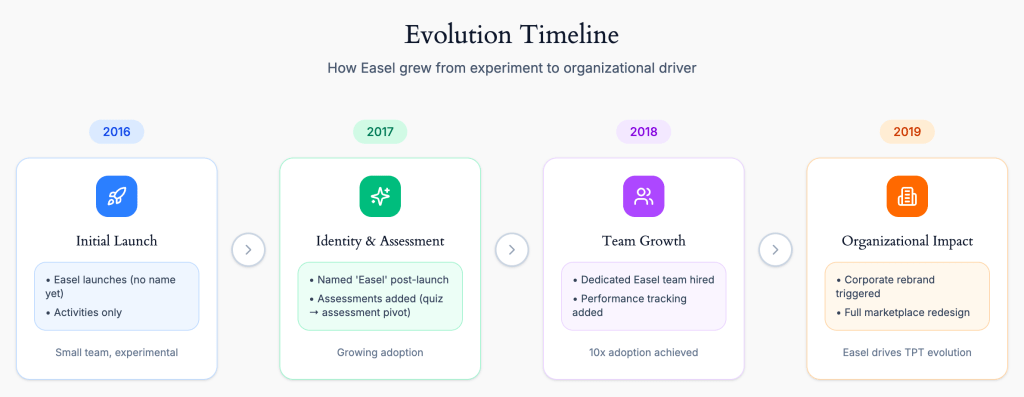
Easel’s trajectory from experimental feature to organizational catalyst. What began as an add-on tool eventually required TPT to reimagine its entire brand and marketplace—demonstrating how product success can drive company-wide transformation.
From Patchwork to Integration: The Rebrand & Redesign
As Easel gained traction, it became clear that our initial approach—integrating a digital tool into a 10-year-old marketplace—had limitations. Easel was essentially being “pasted on top” of an infrastructure built for downloadable PDFs.
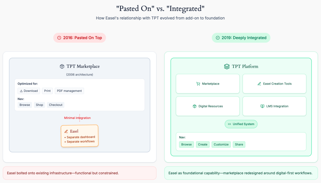
The infrastructure evolution: Easel’s initial success exposed the limitations of treating it as an add-on. The 2019 rebrand and marketplace redesign enabled Easel to become a core platform capability, not a bolt-on feature, requiring organizational transformation to keep pace with product success.
The progress we were making with Easel, combined with other strategic shifts at TPT, catalyzed two major initiatives:
A corporate rebrand that repositioned TPT from a marketplace for printable materials to a platform for digital teaching tools.
A complete marketplace and site navigation redesign that allowed us to integrate Easel more deeply into the core experience, rather than treating it as an add-on feature.
These weren’t separate projects—they were a recognition that Easel’s success required TPT itself to evolve.
→ For the full story of how Easel influenced TPT’s corporate rebrand, see the TPT Rebrand case study.
→ For detailed information about how Easel was integrated into the marketplace redesign, see the TPT Marketplace Redesign case study.
What I Learned
1. Launching a Tool Is Different Than Launching a Resource
TPT was built to sell resources (PDFs, worksheets). Easel was a tool. This distinction shaped everything:
- Resources are self-explanatory; tools require education
- Resources are one-time purchases; tools need ongoing engagement
- Resources compete on quality; tools compete on flexibility
Understanding this early helped us design onboarding, positioning, and education systems that treated Easel like the tool it was—not like another downloadable resource.
2. Identity Isn’t Just Branding—It’s a Product Design Constraint
Without a name, Easel couldn’t be talked about, marketed, or designed around. Once it had an identity, every design decision became clearer: Does this feel like “Easel”? Does this reinforce Easel’s values?
Branding was a foundational constraint that shaped product decisions.
3. Onboarding is Product Design, Not Marketing
The three workflows (customize, discover, create) weren’t just features—they were fundamentally different mental models. Onboarding wasn’t about “teaching the product”; it was about helping teachers understand which workflow applied to their situation.
This required designing the dashboard, empty states, and marketplace integration as educational surfaces—not just functional ones.
4. Division of Labor Requires Clear Ownership
Working alongside another designer meant being explicit about ownership. She owned the authoring tool; I owned everything around it. This clarity prevented overlap and allowed us to move faster.
But it also required constant communication: her tool decisions affected my positioning decisions, and vice versa.
5. MVPs Should Be Flexible, Not Perfect
Easel’s initial launch was narrow (just Activities). The assessments’ launch was also narrow (just a few question types). But both were designed to be extensible.
This “launch narrow, build flexible” approach allowed us to learn fast without locking ourselves into rigid product architectures.
6. Product Success Can Force Organizational Evolution
Easel’s success exposed the limitations of TPT’s existing infrastructure. What started as “let’s add digital tools” eventually required a corporate rebrand and complete marketplace redesign.
Sometimes the best products don’t just solve user problems—they reveal what the organization needs to become.
Why This Project Matters
Easel wasn’t just a product launch—it was a fundamental shift in what Teachers Pay Teachers was.
The company was known for selling resources: finished materials that teachers could download and use. Easel was a tool: something teachers had to learn, customize, and integrate into their workflow.
The design challenges weren’t just about UI or features. They were about:
- Identity: How do you give a tool its own brand while keeping it connected to the marketplace?
- Education: How do you teach four different workflows without overwhelming users?
- Positioning: How do you market a tool inside a marketplace built for resources?
These are the same challenges that show up whenever you’re launching something fundamentally new inside an established product:
- A creation tool inside a consumption platform (Spotify adding podcasting tools, Netflix adding interactive content)
- A professional feature inside a consumer product (Instagram adding business accounts)
- A digital service inside a physical marketplace (Target adding same-day delivery)
The lesson is consistent:
When you’re introducing something that requires behavior change, design needs to do more than make things “easy.” It needs to help people understand what the new thing is, why it matters, and when to use it.
That’s what made Easel hard—and what made it successful.
Explore the Details
This case study provides an overview of Easel’s launch and evolution. For deeper dives into specific design challenges:
- Naming and Branding Easel – How we developed the name, visual identity, and positioning
- Positioning Easel in the Marketplace – How design influenced go-to-market strategy
- Reframing Quizzes as Assessments – How research prevented us from building the wrong product
- TPT Rebrand – How Easel’s success catalyzed a corporate rebrand
- TPT Marketplace Redesign – How Easel was integrated into the broader marketplace redesign
Launching a New Product? Working in EdTech?
I’m available for full-time or contract work and would love to help with your project. Drop me a line and let’s see how we can work together.

You must be logged in to post a comment.