TPT had never implemented a formal design system, which made it difficult to maintain consistency and efficiency as the platform grew. Without a unified system, design and development efforts were often duplicated, slowing down the ability to test and launch new features.
To address this, we built a scalable, cohesive design system that standardized UI components, streamlined workflows, and improved the overall user experience. This was a mission-critical initiative to accelerate the velocity of product iteration, enabling faster testing, development, and rollout of new features across TPT’s expanding ecosystem. from a marketplace for printable resources to a digital-first ecosystem, the need for a scalable, cohesive design system became critical. The existing UI lacked consistency, making it difficult for designers and engineers to efficiently create new experiences. My role was to lead the creation and adoption of a design system that would streamline workflows, improve visual consistency, and enhance usability across the platform.
The Problem: A Fragmented UI and Inefficient Workflows
Before implementing a formal design system, TPT’s product faced several challenges:
- Inconsistent UI components – Buttons, forms, and layouts varied across different pages.
- Redundant design efforts – Designers recreated components for each project, leading to inefficiencies.
- Development bottlenecks – Engineers lacked a unified component library, increasing development time.
- Scalability issues – As the platform expanded, maintaining visual and functional consistency became harder.
Assembly: A Scalable, Systematic Design System
The goal was to build a flexible yet standardized design system that served both designers and engineers while elevating the overall user experience. In keeping with using education terminology we named our design system Assembly.
1. Establishing a Design Language
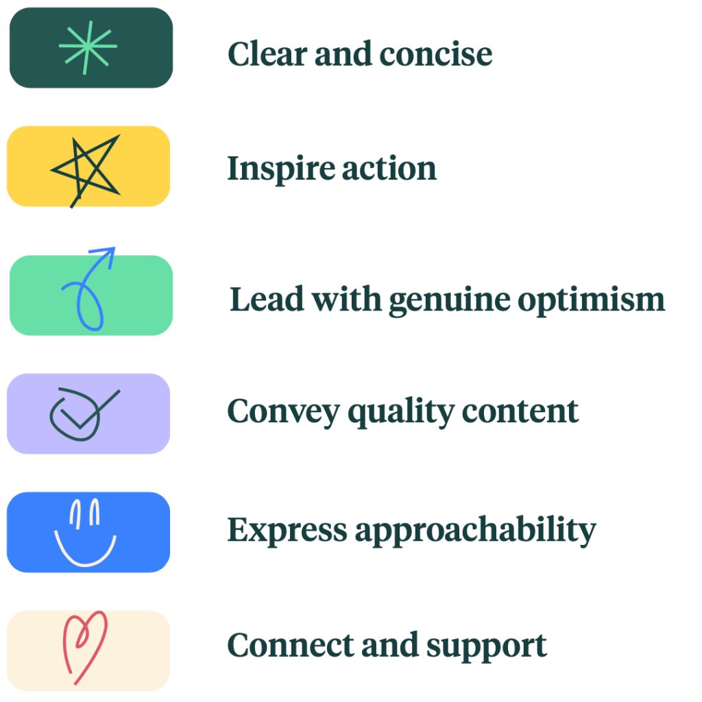
We were guided by the core TPT design principle:
Clear and Concise.
As the umbrella brand, the design system for TPT needed to be cohesive, clean, engaging, and consistent. Designing with intentional hierarchy would clearly direct and guide the eye, helping users easily and quickly navigate. Additionally, while ensuring consistency between sub-brands, we also needed to maintain clear delineation among its united parts.
We started by defining the core visual and interaction principles that would guide the system:
- Clarity & Simplicity – Rooted in TPT’s Clear and Concise principle, the design system was structured to reduce cognitive load with clean, well-organized layouts that naturally guide user attention.
- Accessibility – Ensure color contrast, typography, and interactive elements met WCAG standards.
- Consistency – Standardize UI patterns to create a seamless experience across the platform.
- Scalability – Design components that adapt to new features and product expansions.
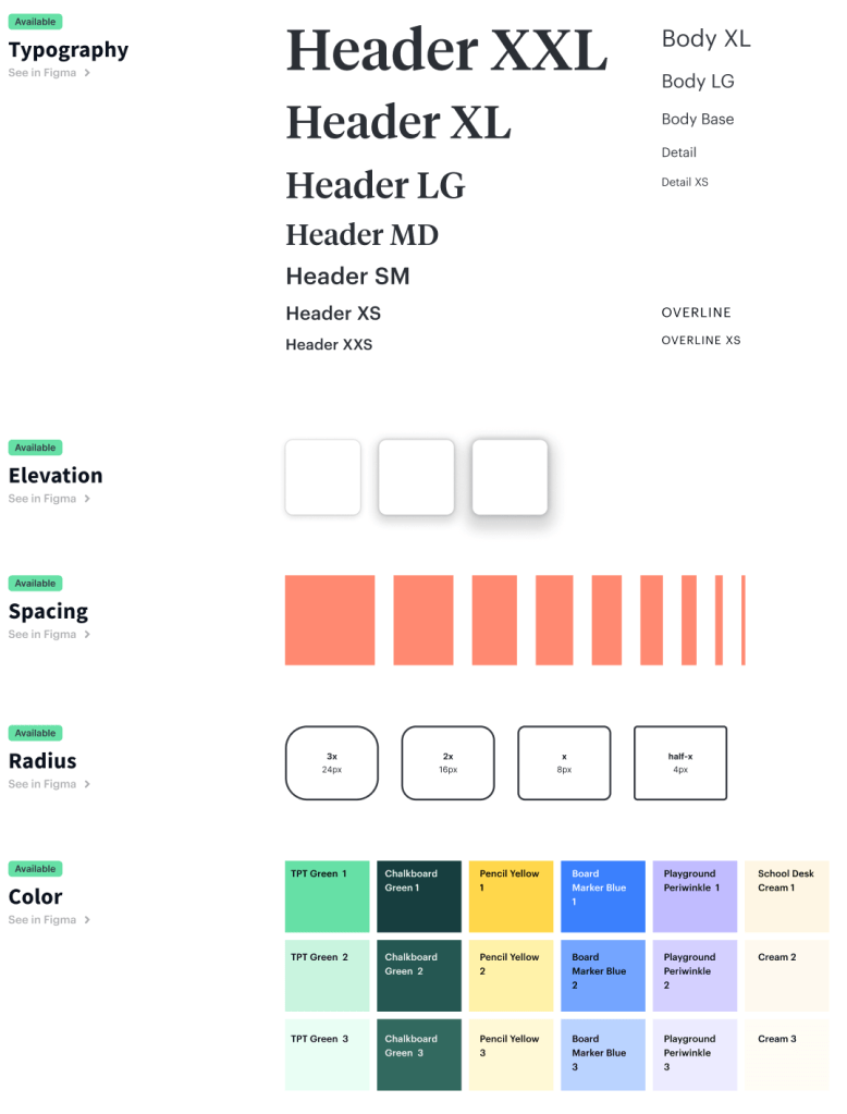

2. Creating a Component Library
We audited existing UI elements and consolidated them into a single source of truth in Figma:
- Typography & Color Styles – Defined a structured type scale and brand-compliant color palette.
- Reusable UI Components – Built buttons, modals, form fields, and navigation elements as modular, reusable elements.
- Grid & Layout System – Established responsive breakpoints for a flexible design approach.
- ‘What’s in Production’ Page – A dedicated Figma page showcasing screens for all major page types and sections of the site, ensuring designers had an easy reference for what was live. Each designer responsible for an area kept this source of truth updated, maintaining alignment between design and development.
3. Theming for Legacy & Rebrand Transition
TPT had a significant amount of legacy code, and replacing everything with the new React-based design system was going to take time. Additionally, with an upcoming rebrand, we needed a way to gradually roll out the new design system while maintaining visual consistency across the platform.
To address this, we implemented a themed design system in Figma, allowing designers to work with UI components that could toggle between legacy and rebranded aesthetics. This ensured:
- A seamless transition—Designers could create mocks using components then easily switch between the legacy or rebrand look and feel because the components were all themed.
- Phased rollout—The legacy-themed components allowed for gradual implementation without disrupting the existing user experience.
- Engineering efficiency—Once the rebrand was tested and ready, a simple “flip of the switch” in the design system enabled the new look across all UI components.
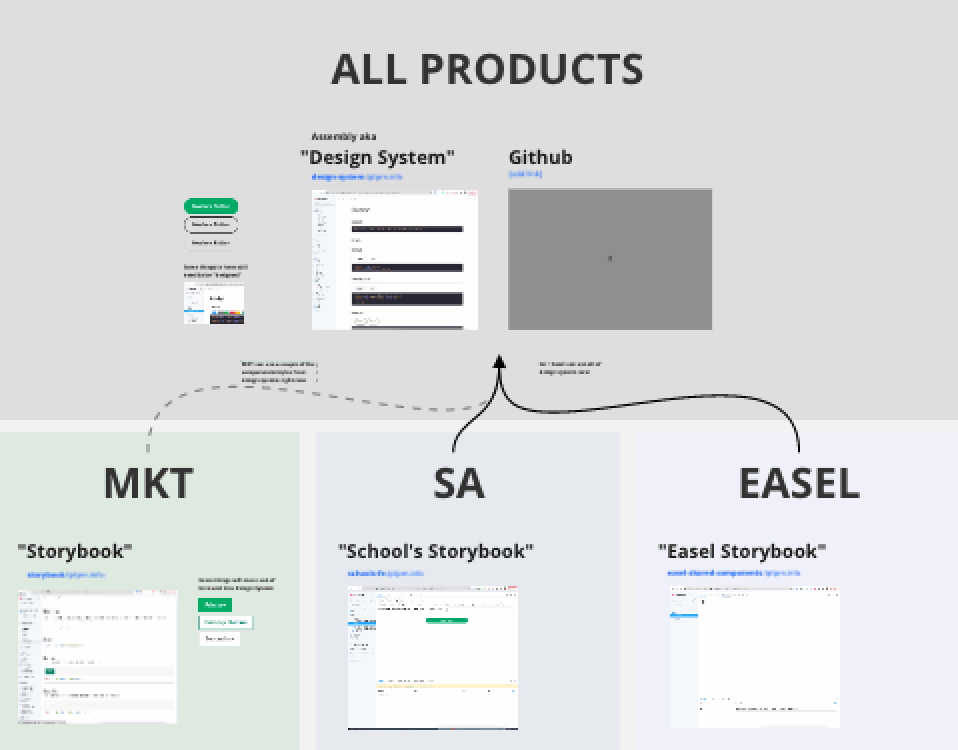
4. Expanding the Design System for New Products
While the core design system was being developed, TPT was simultaneously building Easel, an interactive editing tool that required a unique set of components tailored for editing: toolbars, icons, dropdowns, alerts, and other feedback interactive components. Unlike the marketplace, Easel’s UI needed to support real-time interaction and content creation, requiring a more dynamic approach to component design.
To maintain consistency across TPT’s expanding ecosystem, the design system was structured to be extensible. This allowed for:
- A shared foundation—Core elements like typography, colors, and form inputs remained consistent across all TPT products.
- Product-specific extensions—Easel, as well as School Access, had unique components that were built on top of the foundational system.
- Scalability—Future products could adopt the same methodology, ensuring a seamless user experience across TPT’s platform.
5. Partnering with Front-End DevOps for Implementation
A design system is only as good as its implementation. While designers need to use the components in their workflows, front-end engineers must integrate them into the product for real impact. We were fortunate that TPT had a dedicated DevOps team responsible for implementing the design system, ensuring that updates were executed efficiently and at scale.
I worked closely with the leader of DevOps to coordinate a rollout plan that aligned with ongoing product engineering work. Since replacing all legacy components with the new React-based design system would take time, we leveraged the rebrand as an opportunity to implement the new components site-wide. Rebrand testing results validated that the new system worked as intended, giving us the confidence to proceed with full adoption.
Our approach included:
- Strategic rollout planning – Balancing design system adoption with existing product roadmaps to avoid bottlenecks.
- Incremental implementation – Phased updates to minimize disruption while ensuring UI consistency.
- Tracking adoption goals – Establishing benchmarks to reach 100% implementation across the platform.
By making DevOps a key partner in the process, we ensured that the design system was not just a design initiative but a scalable, fully integrated system that improved development efficiency and user experience. To ensure seamless implementation, we collaborated closely with engineers to develop a shared React-based component library. This included:
- Documenting component usage in Storybook to align design and development teams.
- Designers and engineers working side-by-side to ensure what was being designed was what could and would be implemented.
- Running regular syncs to ensure the system evolved based on real-world usage and feedback.

6. Driving Adoption & Education
A design system is only valuable if it is understood, adopted, and actively used. This was the first time TPT had used Figma for a design system, and the designer leading the project did an exceptional job not only in designing nested, dynamic components—a Figma feature that allowed for modular, reusable elements—but also in ensuring that the entire team felt comfortable using the system.
Given the system’s technical complexity and customizability, regular training workshops were held with a “no dumb questions” mindset, fostering an open and collaborative learning environment. These sessions:
- Demonstrated best practices for using nested components efficiently.
- Encouraged designers to ask questions and experiment with the system.
- Ensured consistency across all teams by reinforcing proper usage.
The “what’s in production” page had another benefit: the designer who owned the design system could keep on eye on the most recent version of everyone’s designs to make sure components were being used correctly. If help was needed, it could be dispatched and solved quickly.
By investing in education and adoption, the design system became a seamless part of the workflow, empowering designers to work faster and with greater confidence. Rolling out a design system is as much about culture change as it is about UI consistency. We focused on:
- Educating teams through training sessions and documentation.
- Providing Figma templates to accelerate new feature design.
- Establishing governance to maintain the integrity of the system as it scaled.
What Wasn’t Achieved
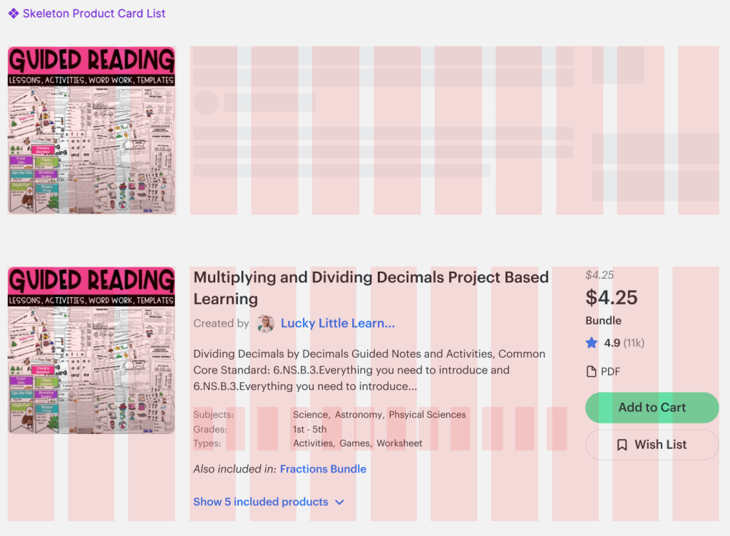
While the design system rollout was highly successful, some planned initiatives didn’t make it to implementation. One key feature we aimed to introduce was content placeholders or ‘skeleton loaders’—a technique that provides an instant sense of visual hierarchy before content fully loads. This would have improved perceived performance and reduced user frustration.
However, given the scope of work and competing priorities, it became clear that this feature was unlikely to rank high on the implementation list. A key part of prioritization in design leadership is being realistic about what can be built—similar to the classic writing advice “kill your darlings.” As one of my colleagues once put it, “We never finish anything, we just stop working on it.”
Recognizing these trade-offs is essential to focusing efforts on the highest-impact improvements, ensuring that the design system could be successfully integrated without overloading engineering resources.
Outcome & Impact
The introduction of TPT’s design system led to measurable improvements:
- 30% reduction in design and development time due to reusable components.
- Increased UI consistency, leading to a more cohesive and polished user experience.
- Greater accessibility compliance, ensuring inclusivity across all user interactions.
- Faster onboarding for new designers and engineers, reducing ramp-up time.
Key Takeaways
- Design systems drive efficiency – By standardizing UI components, teams can move faster and focus on solving bigger UX challenges.
- Cross-functional collaboration is essential – Partnering with engineering ensured smooth implementation and long-term adoption.
- Education and governance matter – A design system is only successful if teams understand how to use it and keep it evolving.
The success of TPT’s design system not only improved the internal design and development workflow but also enhanced the overall user experience, creating a more cohesive and scalable product.
Need Help with your Design System?
I’m available for full time or contract work and I’d love to help you with your project. Drop me a line and let’s see how we can work together.
 Justin Dickinson
You must be logged in to post a comment.