Design evolves as organizations grow. What begins as a focus on fundamental execution inevitably transforms into strategic influence that shapes both product development and company direction. This evolution doesn’t happen by accident—it’s guided by principles.
What Are Design Principles?
Design principles are foundational guidelines that help teams create consistent, intentional, and user-centered experiences. They serve as a north star for design decisions, ensuring alignment across products, teams, and branding efforts. Historically, design principles have been used in architecture, industrial design, and graphic design, evolving into a critical part of digital product development.
By defining a clear set of design principles, companies can establish a cohesive vision for their brand and product experience. These principles guide everything from interface design and usability to brand voice and accessibility, ensuring that every touchpoint reflects a shared philosophy.
First, Some Famous Examples
Many of the world’s top brands have published their design principles, offering valuable insights into how they approach product and experience design. Here are a few well-known examples:
Google’s Material Design Principles
Google set out to create a unified design system that ensures consistency across its vast ecosystem—including Gmail, Drive, Search, and Android. The result was Material Design, introduced in 2014, a design language that provides a shared visual and functional framework across products and platforms. By standardizing interactions, layouts, and aesthetics, Material Design reinforces Google’s brand identity and makes its interfaces instantly recognizable and intuitive.
Why Material Design Is Essential:
- Cross-Product Uniformity – Maintains a cohesive look and feel across all Google products, ensuring seamless user transitions between services.
- Intuitive Interactions – Depth, motion, and hierarchy improve usability by mirroring real-world interactions.
- Scalability – Well-defined color schemes, spacing, and typography make it easy to apply across various platforms and devices.
- Developer & Designer Efficiency – A robust design system with detailed guidelines, reusable components, and patterns speeds up development while ensuring brand consistency.
- Material Metaphor – Uses shadows, layers, and textures to create a tactile, paper-like experience, bridging the gap between physical and digital design.
IBM’s Design Language
In 1956, IBM set out to create a unified design system to bring consistency to its vast and complex ecosystem, spanning enterprise software, AI solutions, cloud platforms, and hardware. As IBM grew into a global technology leader, the need for a cohesive and scalable design approach became critical. The IBM Design Language was introduced to establish a clear visual and functional framework, ensuring IBM products feel intuitive, accessible, and unmistakably IBM while adapting to rapid technological advancements.
Why IBM Design Language Is Essential:
- Cohesive User Experience – Establishes a consistent look, feel, and behavior across IBM’s diverse product ecosystem, from AI-powered interfaces to enterprise software.
- Human-Centered Approach – Prioritizes clarity, accessibility, and usability, ensuring designs are intuitive and inclusive for a global audience.
- Scalability – Built to adapt across various devices, industries, and emerging technologies while maintaining a unified brand presence.
- Design & Development Efficiency – Provides structured guidelines, reusable components, and a flexible grid system to streamline collaboration between designers and developers.
- Timeless & Evolving – Balances IBM’s rich design heritage with modern digital trends, ensuring longevity while embracing continuous innovation.
Airbnb’s Design Principles
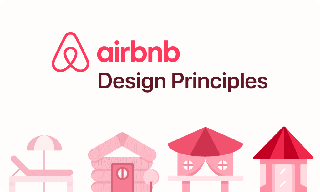
Airbnb recognized the need for a unified design system to maintain consistency as its platform expanded globally, ensuring a seamless user experience for both hosts and guests. As Airbnb grew, the company faced challenges in delivering a cohesive brand experience across a wide range of products and services, while also accommodating diverse cultural contexts and user needs. To address this, Airbnb developed the Airbnb Design Language System (DLS)—a set of design principles that prioritize clarity, simplicity, and human-centered design to create an accessible and consistent experience across their platform.
Why Airbnb’s Design Principles Are Essential:
- Consistent Brand Experience – Ensures that Airbnb’s platform feels cohesive and recognizable across different devices and user touchpoints.
- User-Centered Simplicity – Prioritizes intuitive navigation and clear visual hierarchy, making booking and hosting effortless.
- Scalability – A flexible system that adapts to new features, markets, and evolving user needs without compromising design integrity.
- Efficiency for Designers & Developers – Provides reusable components and a shared framework that streamlines collaboration and speeds up product development.
- Emotional & Inclusive Design – Focuses on warmth, approachability, and accessibility, ensuring Airbnb is welcoming for users of all backgrounds and abilities.
Design Principles Matter for Design and Business
These principles help guide teams, ensuring that their products feel cohesive, intentional, and user-friendly across every touchpoint. Design principles aren’t just for designers, they have a profound impact on company-wide alignment, brand perception, and product success. A strong set of principles serves as a framework for decision-making, ensuring that every interaction, visual element, and product experience aligns with a shared vision.
A great design leader takes the time to make these principles clear, ensuring they extend beyond the design team to influence not just product decisions but also external brand positioning and perception. Business leaders appreciate this clarity because it gives them tangible talking points about what is often an abstract creative process. Design leadership and advocacy bring unexpected benefits, fostering company-wide alignment and strengthening a brand’s strategic direction. When done well, they help define not only how a product looks and functions but also how the brand is perceived in the market.
Use Principles to Move Faster
For a design team, principles can often feel intuitive, but extracting and formalizing them into clear guidelines provides a wayfinder for decision-making, brand perception, and company-wide alignment. A strong set of principles ensures that every interaction, visual element, and product experience aligns with a shared vision.
Having clear and established design principles can also accelerate decision-making. Throughout my leadership experience at companies like Vimeo, Namely, and Teachers Pay Teachers (TPT), I’ve seen how contextualizing a design decision within a principle gives it a reason that justifies personal preference. When I scaled TPT’s design team from 2 to 12 members, our principles became crucial mechanisms for maintaining quality while increasing delivery velocity threefold.
Design teams often face the question “Why this?”, and using an agreed-upon principle helps explain the rationale behind a choice. This not only builds trust within teams but also ensures that decisions are consistent and aligned with broader business goals. In executive conversations, principles transform subjective design discussions into strategic alignment opportunities.
Defining Design Principles for TPT and Easel
I was lucky to have the opportunity to enshrine the design principles at TPT despite the brand being around for over 10 years. The TPT design principles were created as part of the company’s rebrand, making them more aspirational and reflective of the broader brand identity while preserving what had always made the brand beloved by teachers. When evolving the TPT brand and design system, it was essential to define principles that would guide both visual design and user experience decisions. Since TPT serves educators, sellers, and students, the principles needed to ensure clarity, accessibility, consistency, and safety across all interactions.
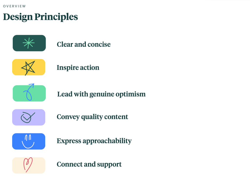
TPT’s Core Design Principles
- Clear and Concise – As the umbrella brand, the design system for TPT should be cohesive, clean, engaging, and consistent. Designing with intentional hierarchy will guide the eye and help users easily navigate. There should be consistency between sub-brands, but also a clear delineation among its united parts.
- Inspire Action – Whether diving into resources, contributing to initiatives, or planning curricula, the brand should encourage users to take intentional action. This is achieved through visual cues, strategic layout, and engaging imagery that promote creativity and problem-solving.
- Lead with Genuine Optimism – TPT’s tone should be positive, yet realistic. The visuals and messaging should be uplifting, supportive, and resourceful, while acknowledging challenges teachers face. The goal is to instill confidence and a can-do attitude.
- Convey Quality Content – TPT is a trusted, reputable resource for high-quality educational materials. While the brand remains approachable, it also maintains a structured and refined aesthetic that elevates content without leaning too far into trends.
- Express Approachability – The brand should feel genuine, real, and relatable. This is conveyed through color choices, balanced design elements, and artwork that reflects authentic classroom experiences. The interface should engage, not intimidate, creating a welcoming digital space.
- Connect and Support – TPT’s brand identity embodies collaboration, community, and teacher empowerment. The design system reflects inclusion, encouragement, and shared expertise, ensuring teachers feel valued as leaders in the education space. Intentional hierarchy should guide the eye and make navigation effortless.
These principles were embedded into the TPT design culture, influencing everything from typography and color choices to interaction patterns and UI components. What made them particularly effective was that they weren’t just posted on walls—we integrated them into our design system documentation, review processes, and cross-functional workshops. This systematic approach resulted in a 12% improvement across key metrics despite significant architecture changes in our platform redesign.
Easel’s Unique Design Principles

While TPT had broad brand principles, Easel, TPT’s digital interactive tool, required its own set of principles to reflect its unique functionality. Unlike the broader marketplace, Easel represented a strategic evolution in TPT’s mission, bridging the gap between content discovery and classroom implementation. As the cornerstone of TPT’s digital transformation strategy, Easel needed to support creation, collaboration, and real-time interaction while expanding the platform’s value beyond traditional resource sharing.
Easel was designed to empower teachers with intuitive, engaging, and flexible digital tools, amplifying their expertise in the modern classroom and significantly extending TPT’s ecosystem from content marketplace to comprehensive teaching toolkit. As a business-critical initiative that would redefine TPT’s competitive positioning, Easel required its own design principles to ensure a seamless, interactive, and creative experience that would drive adoption and retention:
- Intuitive Consistency – Easel should feel powerful yet easy to pick up and use, leveraging familiar design patterns and clear visual metaphors grounded in real-world teaching practices. Movement and stacking (z-index) serve as visual metaphors for a physical workspace.
- Obvious Interaction – As a digital editing tool, Easel adds interactive elements to analog workflows, requiring clear differentiation between static and interactive elements. Every action provides immediate, perceptible feedback to reinforce user confidence.
- Energize Creativity – The interface is clean, simple, and warmly familiar, using a conversational yet focused tone to spark creativity and joy. Thoughtful typography, grids, whitespace, and color create a structured yet inviting environment.
- Reflect and Elevate – Easel is a canvas for teacher creativity, capturing their work in a polished and aspirational way. The design enhances—not overshadows—their contributions, providing foundational elements that feel modern and flexible.
- Enhanced Experimentation – Just like the classroom, Easel is always evolving through iteration and user feedback. Visual design, messaging, and product releases should encourage teachers to explore new possibilities within their lessons.
- Seamless Unification – Easel is part of a teacher’s daily workflow, and its integration with other tools should feel effortless. Movement between TPT, Easel, and classroom applications should be smooth and uninterrupted, supporting an efficient and holistic teaching experience.
Since Easel was brand new (and the design team was new to building this kind of product), we extended the design principles further to set some high-level guidelines to both encourage and inspire:
- Empower the Teacher – Give educators control over content customization while ensuring ease of use.
- Guide, Don’t Overwhelm – Offer contextual help and smart defaults to assist without interfering.
- Consistent, Yet Distinct – Align with TPT’s broader ecosystem while establishing Easel as a specialized tool.
These principles helped us prioritize features, refine the UI, and ensure that every design choice enhanced the teaching experience. The guidelines also offered context in which to review the work. Since this was a new product, there wasn’t a lot of data available, so when evaluating work, these guidelines served as a north star, a way to settle disputes, and a shared context for providing constructive criticism.
What made this approach particularly successful was our ability to use these principles to align cross-functional teams quickly. Product managers referenced them when prioritizing features, engineers used them to evaluate technical implementations, and marketing teams leveraged them to develop consistent messaging. This alignment accelerated our product development cycle and led to adoption rates that exceeded our initial targets by over 20%.
Transformative Leadership Through Design Principles
Throughout my career leading design teams, I’ve found that principles aren’t just tools for designers—they’re instruments of organizational change. When implemented effectively, they transform how companies understand and leverage design.
From Service Provider to Strategic Partner
At both Vimeo and TPT, I used principles to elevate design from a service function to a strategic driver. By demonstrating how principles directly impacted business metrics, from conversion rates to user retention, I helped executive teams recognize design as a core competitive advantage rather than just a cosmetic consideration.
Design Advocacy Practices
The most successful design leaders don’t just create great designs; they create systems that empower others to champion design thinking. At TPT, I developed workshops that helped product managers, engineers, and marketing teams understand and apply our design principles to their work. This approach multiplied our design influence without requiring additional headcount.
Measuring Principle Effectiveness
Principles become powerful when connected to measurable outcomes. For the Easel product, we tracked how each principle contributed to specific metrics, from onboarding completion rates to feature adoption. This data-driven approach helped us refine our principles over time and proved their business value to stakeholders.
Why Design Leaders Must Prioritize Principles
Establishing clear design principles is a powerful way to make the design process more visible within an organization. Too often, design can feel like an abstract or subjective discipline to those outside of it. By formalizing principles, design leaders provide a framework that increases design advocacy, aligns teams, and elevates design’s impact on business strategy. When leadership, engineering, and marketing teams can point to design principles as a foundation for decisions, it strengthens the role of design as a strategic driver rather than just a service function.
- They create company-wide alignment – Design principles help not just designers but also marketing, engineering, and leadership stay on the same page about how products should feel and function.
- They shape external brand perception – Strong principles ensure consistency across every touchpoint, reinforcing a clear, recognizable brand identity.
- They influence product decision-making – A great design system is more than components—it’s about intent, guiding product teams toward user-centered solutions that stay true to the brand’s values.
A design leader’s role is to ensure these principles are embedded into the company culture, used to drive innovation, and consistently referenced across teams. Whether defining principles for an entire brand, a specific product, or a design system, taking the time to articulate them ensures that every experience feels thoughtful, cohesive, and strategically aligned.
Principles as Competitive Advantage
As organizations face increasing competition and rapid market changes, the ability to make consistent, strategic design decisions becomes a significant competitive advantage. Design principles provide the framework for this consistency, allowing teams to move quickly without sacrificing quality or coherence.
For companies looking to elevate their design impact, investing in thoughtful, well-articulated principles isn’t optional; it’s essential. It’s how design transforms from a supporting function into a driving force for innovation and growth.
In my leadership roles, I’ve consistently seen how principles-driven design teams create better products and influence company strategy, strengthen brand perception, ultimately driving better business outcomes. As markets evolve and user expectations rise, the organizations that thrive will be those that recognize design principles as fundamental business assets worthy of executive attention and investment.
The evolution from fundamental execution to strategic influence must be guided by principles, championed by design leaders, and embraced by forward-thinking organizations ready to transform how they create value for their customers and their business.
Have you established your design principles?
I’m available for full time or contract work and I’d love to help you with your project. Drop me a line and let’s see how we can work together.
 Justin Dickinson
You must be logged in to post a comment.