
Quick Context
Company: Teachers Pay Teachers (TPT)
Timeline: Two weeks (time-boxed vision project)
My Role: Design Lead, Player-Coach
Team: Me + PMs from Marketplace, School Access, and Easel
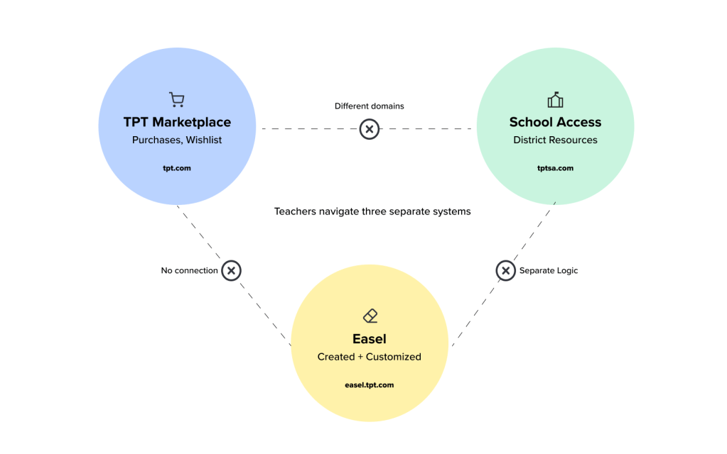
Teachers Pay Teachers was evolving from a marketplace for printable PDFs into a digital-first platform with Easel (our custom editor) and School Access (district-level resource access). But the product experience hadn’t kept pace—teachers had to navigate three separate systems across different domains just to access their content.
I spent two weeks designing “My Library”—a unified vision for how teachers could access everything they owned, created, or had access to in one place. While the complete vision didn’t launch immediately, it served as a north star that influenced multiple teams’ roadmaps, enabled the integration of School Access bookmarks into TPT, and established reusable design patterns that accelerated our design system rollout.
The Challenge: Three Systems, Zero Integration
The Fragmentation Problem
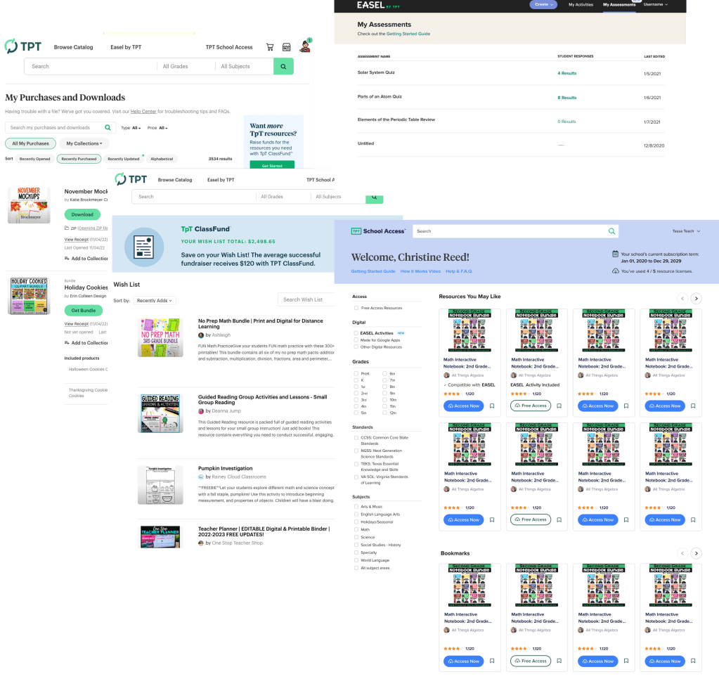
There was no “My Library” when this project started. Instead, teachers navigated a maze of disconnected pages across three different systems:
TPT Marketplace (tpt.com):
- My Purchases – The main destination (second-most visited page after search), showing printable PDFs and Easel resources bought from the marketplace
- Wishlist – Resources saved to buy later
School Access (tptschoolaccess.com – separate domain):
- Bookmarks – Free resources available to those teachers who have SA accounts through district-level licensing, only accessible on the School Access domain and invisible in TPT.
Easel (easel.tpt.com, separate dashboard):
- Created/Customized Resources – Anything teachers created in Easel, including customizations to purchased marketplace Easel resources
Hidden entirely:
- Recently Accessed Resources – We tracked this data, but didn’t surface it to users
Teachers with School Access accounts essentially had two separate logins on two different domains that didn’t talk to each other. A teacher couldn’t see their complete picture of resources—what they’d purchased, what they’d created, what they had access to through their district—without switching between systems.
The Business Case
My Purchases was the most-visited page after search. If we could transform it into a unified library, it could become a key driver of Easel adoption, School Access engagement, and marketplace sales. But we needed to prove the value before asking engineering teams across three different systems to coordinate on complex integration work.
The PM I partnered with (along with PMs from School Access and Easel) owned several key metrics that fragmentation was impacting:
- Users accessing their purchased content – Hard to find means low engagement
- Opening digital resources in Easel – Teachers didn’t discover they could edit content
- Editing and creating in Easel – Adoption was stalling due to poor discoverability
- Accessing School Access bookmarks in TPT – Cross-domain navigation was broken
- Purchases of recently viewed content – No path from browsing to buying
- Cart abandonment – Users couldn’t easily find bookmarked items when ready to purchase
Qualitative research reinforced the problem: teachers consistently expressed frustration about not being able to find what they were looking for. More critically, they had to remember which system housed which content—a cognitive burden that hurt the entire product experience.
What We Set Out to Do
The marketplace designer was working on an MVP to improve My Purchases by:
- Better representing Easel resources alongside printables
- Linking to the Easel dashboard (since technical constraints prevented showing Easel-created content directly)
- Adding language about how to find School Access resources
This didn’t address the fundamental problem: teachers needed one destination for everything. All of our KPIs required easy access to a teacher’s entire collection—purchased, created, or district-provided. The incremental fixes wouldn’t move the needle.
My Role & Approach: Using Player-Coach Context to Design Across Silos
As a player-coach who both manages designers and contributes individually, I deliberately take on future-looking projects like this. It allows IC designers to stay focused on roadmap work with their teams, while I use my cross-functional context to define a longer-term vision.
Why This Was Player-Coach Work
This project required understanding the goals, constraints, and roadmaps of three different product areas. As a leader with visibility across all teams, I could see how the fragmentation hurt the entire user experience and which KPIs a unified solution could move. An IC designer focused on one area wouldn’t have had this cross-functional context.
But I also needed to execute quickly and ground the vision in reality. By designing the actual interface, I could identify what was feasible with our existing design system and where we’d need new components.
Leadership Contributions
I set the strategic direction by framing this as a best-case scenario exercise: design the ideal future state to demonstrate value, then work backward to assess feasibility. This flipped the typical approach of starting with constraints.
I coordinated with PMs from three different teams to ensure the vision aligned with each area’s goals and KPIs:
- Increasing the percentage of users accessing their purchased content
- Driving more teachers to open digital resources in Easel
- Boosting Easel editing and creation activity
- Make those teachers who have access to School Access engage with that catalog regularly
- Converting recently viewed content into purchases
- Reducing cart abandonment by surfacing bookmarked items
I used this opportunity to advance our design system rollout. We were mid-rebrand with a new design system, and I could use My Library to design organisms from the individual atoms we’d created—things like tab-based layouts, filters, list views, and reusable resource modules.
IC Contributions
I designed the entire vision myself over two weeks: wireframes, high-fidelity mockups, tab variations, module concepts, and all the micro-interactions. I worked through multiple filtering approaches and resource display patterns.
I consulted with engineers early to understand technical constraints, particularly around showing Easel-created content in TPT and connecting School Access accounts. This helped me design around known limitations while still pushing for the ideal experience.
I created a library of reusable design system components—tabs, two versions of filters, resource lists, resource modules, resource labels—that could be implemented not just in My Library but across the entire product.
How These Modes Reinforced Each Other
My leadership context enabled the IC to work more strategically by clarifying the future state. Suddenly, I wasn’t just designing a better My Purchases page—I was creating a solution that could unify three systems and move KPIs across multiple teams.
Staying hands-on kept the vision achievable. By designing with our actual design system components, I proved we could build this with our existing patterns. It also made it easier for other designers who had similar UI needs elsewhere.
The Process: Designing the Ideal, Then Finding the Path Forward
Starting with the Best-Case Scenario
Rather than beginning with constraints, I set out to design the ideal version—knowing we could remove functionality based on difficulty. The goal was to inspire teams with what was possible and make the case for solving the technical challenges.
This approach served multiple purposes:
- Show the massive value of unifying the three systems
- Demonstrate how our new design system could support complex interfaces
- Create reusable patterns that other designers could reference
- Make the case for cross-team engineering coordination
The Design Challenge: Timing and Opportunity
This project happened at a pivotal moment. We were rolling out a new design system with our rebrand, and had decided all new features would use the latest components. My Library became an opportunity to take our individual atoms (buttons, cards, filters) and combine them into organisms (tabbed layouts, filtered lists, resource modules).
I spent two weeks designing with PMs from all three teams weighing in, ensuring the vision worked for marketplace, School Access, and Easel.
Key Design Decisions
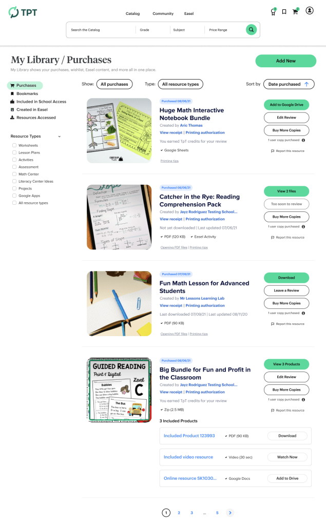
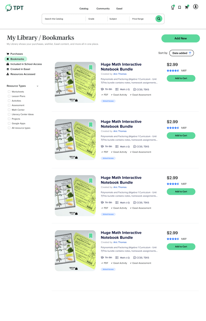
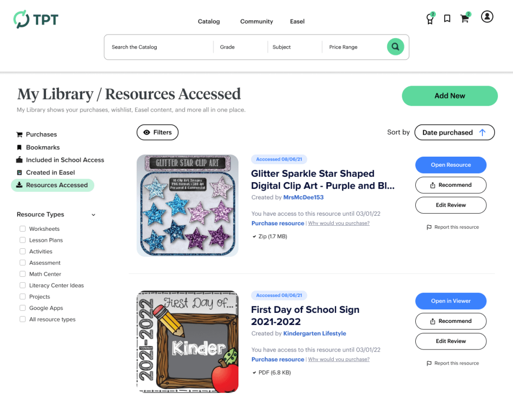
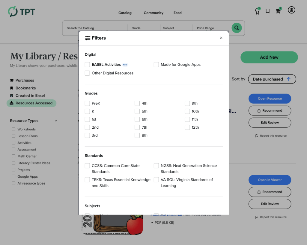
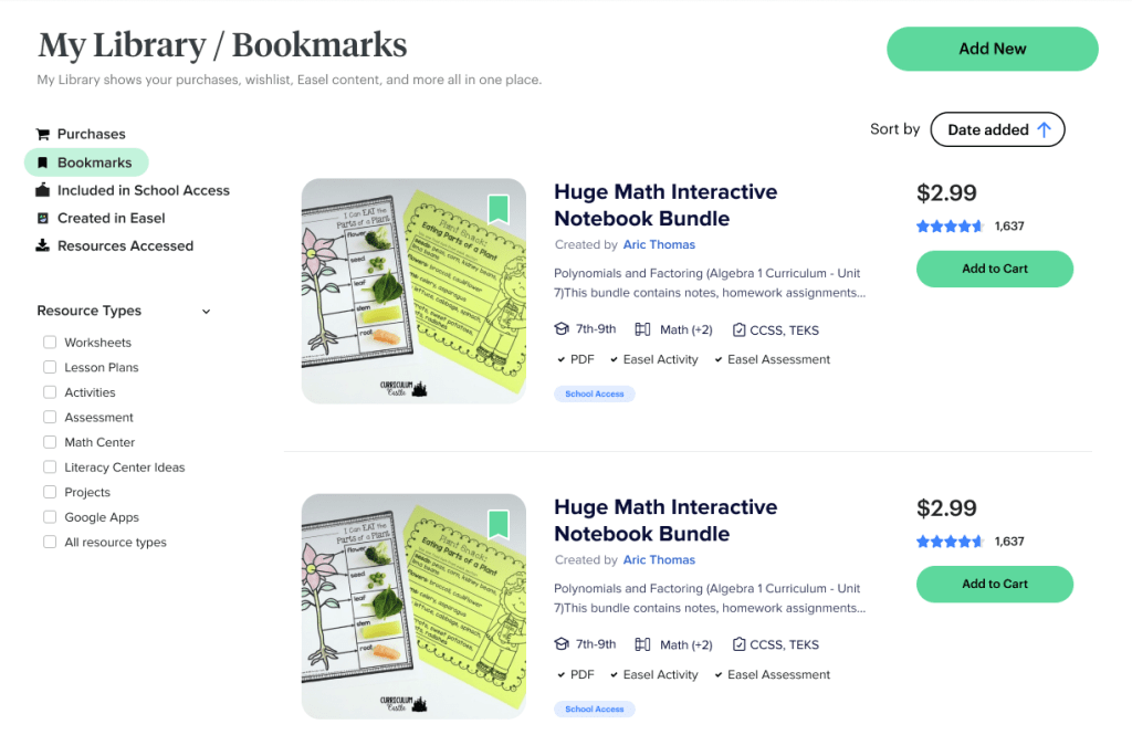
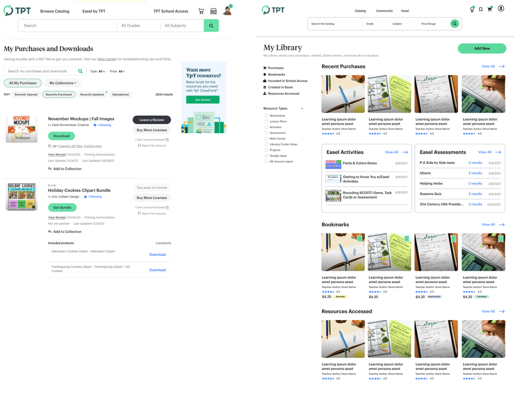
Consolidation through tabs: Instead of separate pages, everything lived under My Library with tabs for Purchases, Bookmarks (School Access), Created in Easel, Wishlist, and Recently Accessed.
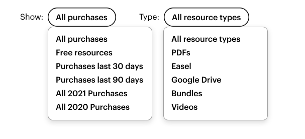
Advanced filtering: Teachers can filter by resource type, format, subject, grade level, and standards, and create custom collections (by class, year, etc.). I designed two versions of the filtering interface to test different interaction patterns.
Module-based discovery: Rather than just lists, I designed modules for recently accessed content, suggested resources, and quick launch into Easel—treating My Library as a personalized dashboard, not just an archive.
Design system at scale: Every component was built from our new design system, proving we could handle complex interfaces without inventing new patterns.
The Solution: One Library, Everything Unified
Bringing Three Systems Together
The core insight was simple: teachers shouldn’t have to remember which system their content was in. Everything should be accessible from one place.
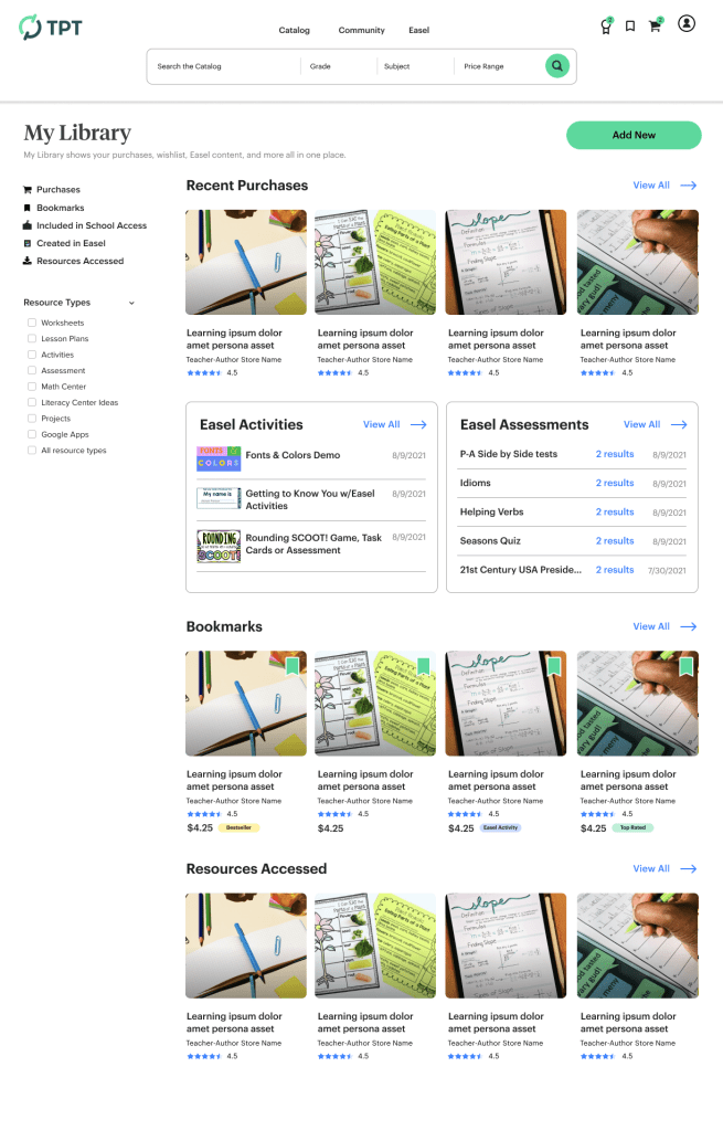
Dashboard Overview
The top-level My Library page served as a dashboard, showing condensed modules as previews of each content type:
- Purchases – Recent or featured bought resources
- Easel Activities – Interactive content created or customized
- Easel Assessments – Assessment tools from Easel
- Bookmarks – Saved resources to purchase
- School Access resources – Flagged for use
- Resources Accessed – Recently viewed materials
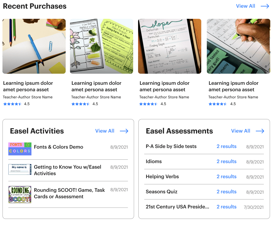
Each module gave teachers a quick snapshot and a pathway to view the whole collection in its dedicated tab.
The Detail Tabs
Purchases: All bought content from the TPT marketplace—printables and Easel resources—with filtering by type, subject, grade, and the ability to create custom collections.
Bookmarks: School Access resources available through district accounts, now visible in TPT (solving the cross-domain navigation problem).
Recently Accessed: Recently viewed resources from any system, creating quick paths back to active materials.
Advanced Filtering & Organization
I designed two versions of the filtering interface to test different approaches to organization:
Modular Components for Reuse
Beyond the main interface, I designed organisms that could be used across the product:
These components became the building blocks for other designers working on different surfaces.
Why This Approach Worked
The consolidation strategy solved the fundamental fragmentation problem by bringing everything into one place, organized however teachers wanted. This directly addressed the qualitative feedback about the difficulty of finding content.
The filtering system and custom collections gave teachers control over organization without requiring massive infrastructure investment in search, while making it easier for them to access their purchased content regularly.
The module strategy mapped directly to our KPIs:
- Recently Accessed encouraged repeat engagement with purchased content
- Bookmarks in TPT reduced the friction of cross-domain switching
- Launch into Easel buttons made digital resource editing more discoverable
- Suggested Content created a path from recently viewed items to purchase
- Unified view reduced cart abandonment by surfacing all saved items in one place
Impact & Results: A North Star That Changed Roadmaps
What Shipped (And What Didn’t)
While the complete vision wasn’t intended to launch as-is, much more of the work got prioritized due to enthusiasm, impact, and clear user value. Even that which was limited by technical complexity had explorations planned to find a “how might we” solution. More importantly, the project fundamentally changed how teams thought about the product:
Immediate wins:
- My Purchases, Wishlist, and Recently Accessed were combined into a single, redesigned interface with the new design system
- School Access bookmarks were integrated into TPT through an engineering workaround, solving the cross-domain problem
- Design system organisms (tabs, filters, resource lists, modules) became reusable patterns across the entire product
Features Implemented Elsewhere
- The Recently Accessed Resources module was added to the logged-in homepage, improving user engagement for returning users.
- Filtering and organization patterns influenced multiple projects across Marketplace and Easel.
- Easel launch pathways were emphasized in other surfaces, helping drive digital resource adoption.
- Modular resource displays became a standard pattern for showing content throughout the product.
Organizational Impact Beyond the Feature
It unified thinking across silos: Teams realized how fragmented the user experience had become. Everyone had been focused on their surface area (TPT, School Access, or Easel) without considering the singular end-user experience. This project made cross-team collaboration a priority.
It accelerated design system adoption: By designing organisms from our new atoms, I gave the design team concrete examples of how to use the new components at scale. This became the reference for how we’d roll out the design system across existing surfaces.
It became a go-to reference: Designers working on other areas of the product used My Library as inspiration for complex interfaces, filtering systems, and modular layouts long after the project.
It demonstrated the value of vision work: This proved that time-boxed explorations could influence roadmaps and define product direction even when they don’t result in immediate builds.
My Specific Contribution
This project could only happen because of the player-coach approach. As a leader with visibility across all three systems, I could synthesize insights and see opportunities that would have been invisible to someone focused on a single area. I understood how unifying these surfaces would affect multiple teams’ roadmaps and KPIs.
As an IC, I could execute the vision quickly and ground it in our actual design system. The combination created a north star that inspired teams while remaining achievable.
The modular approach—designing discrete components that could stand alone—meant pieces of the vision could ship independently when full integration proved complex. This made the project valuable even in partial implementation.
Reflections & Learnings
What Surprised Me
I was genuinely surprised by how much rich interactivity and organization was possible in a surface that had been so static. It revealed that the constraint wasn’t our design system or capabilities; it was that no one had made the case for reimagining this as a unified experience.
I also didn’t expect the downstream impact on team culture. The project forced cross-functional conversations that hadn’t happened before. Suddenly, engineers from different teams were talking about integration, PMs were coordinating on shared KPIs, and designers were thinking beyond their individual surfaces.
The design system work had unexpected leverage. By using My Library to design organisms at scale, I gave the entire design team a playbook for rolling out the new components. What started as a product vision became a design system case study.
What I Learned
- Start with the ideal, then work backward. Designing the best-case scenario first—rather than starting with constraints— can unlock possibilities that incremental thinking would miss. It also makes the business case more compelling.
- Vision work doesn’t have to ship to create value. This project proved that time-boxed explorations can influence roadmaps, inspire teams, define design direction, and solve organizational problems even when they don’t result in immediate builds.
- Modular design enables incremental progress. Because I designed discrete components that could stand alone, pieces of the vision could ship independently when full integration proved complex. The tabs, filters, and resource modules all found homes in other projects.
- Cross-functional visibility is a superpower. Seeing how Marketplace, School Access, and Easel all fit together let me design a solution that moved KPIs across all three areas.
Design systems need real-world stress tests. Using My Library to combine atoms into organisms revealed which components worked at scale and which needed refinement. It was a much more valuable test than theoretical examples.
Need some Future-looking Design Vision?
I’m available for full time or contract work and I’d love to help you with your project. Drop me a line and let’s see how we can work together.

You must be logged in to post a comment.