
When I joined Teachers Pay Teachers (TPT), they were kicking off the start of a new chapter. For years, TPT had been a marketplace for printable resources, but with the rise of laptops in the classroom, the demand for digital materials was growing. At the same time, TPT was evolving its business model, testing district-level sales and launching a new authoring tool for teachers to create interactive lessons and track class progress. This transition required us to take the years of goodwill built with educators and translate it into a new kind of marketplace for digital-first teaching materials.
My role in this transformation was to lead the rebranding and repositioning of TPT, ensuring it not only retained its loyal educator base but also expanded into interactive and data-driven tools like Easel. This effort required a strategic brand evolution, seamless integration of new digital experiences, and careful attention to SEO, usability, and business goals.

The Challenge: Modernizing a Legacy Brand
TPT had a strong reputation among teachers, but its branding, site architecture, and overall messaging were still rooted in the era of printable PDFs. As we introduced Easel—a suite of interactive tools for lesson creation, quizzes, and student performance tracking—we needed to ensure that TPT’s brand and UX reflected its expanded mission.
Key challenges included:
- Brand Evolution: How do we modernize TPT’s identity while maintaining its core values?
- Seamless Integration: How do we introduce Easel as a digital tool without alienating TPT’s existing marketplace audience?
- User Experience & SEO: How do we optimize site navigation and content to drive discoverability and engagement?
The Solution: A Holistic Brand & UX Overhaul
Rebrand Process & Naming
To guide this effort, we hired a brand consultant who helped us refine our brand positioning, messaging, and visual strategy. Through this process, I gained invaluable insight into brand evolution strategies, equipping me with the skills to lead future rebranding initiatives.
We considered a full name change, but TPT had significant brand recognition—8 out of 10 teachers in the U.S. were active users. Instead of starting from scratch, we leaned into TPT, an acronym already used internally and among educators, officially adopting it as the brand name. If it worked for KFC, it would work for us.
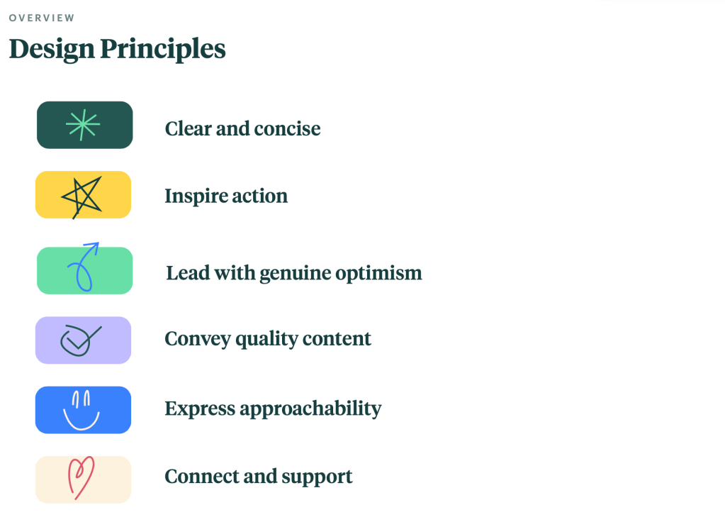
Our logo is an evolution from our origin story

It symbolizes the transference of wisdom and expertise between our teacher community. It aims to project us into the future with its modernity, momentum, and dynamism. And finally, it is built with the intention to flex and adapt to our various product offerings, channels, and mediums.
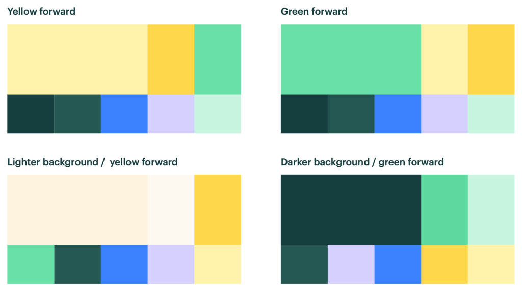
Refining the Brand Identity

To ensure that TPT’s evolution felt natural and strategic, I collaborated with brand experts and visual design agencies to define a refreshed identity that:
- Shifted the brand from a static marketplace to an interactive, digital-first learning hub.
- Maintained visual continuity while introducing a more modern, clean, and adaptable design system.
- Created messaging and branding guidelines that clearly differentiated TPT’s core marketplace from its new interactive offerings.
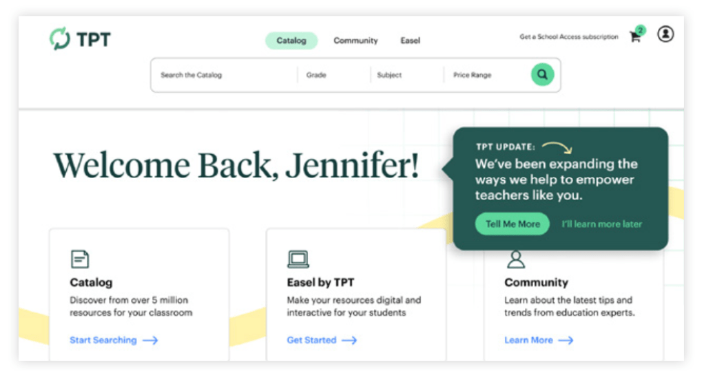
Homepage & Navigation Redesign
Since TPT was evolving beyond a lesson marketplace, the homepage needed to reflect this shift. The previous homepage served as an entry point to search and browse resources, but it lacked a clear way to introduce TPT’s growing range of offerings.
Our solution:
- Added editorial modules to highlight new features, events, and product offerings.
- Designed a more engaging first-time user experience while preserving quick access for daily users.
- Created a phased rollout to test impact at each stage and ensure engagement remained strong.
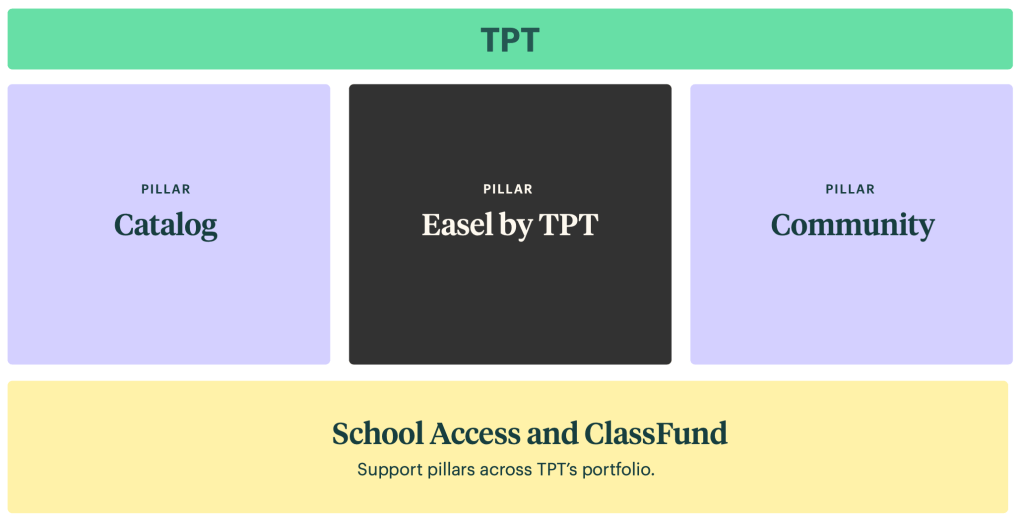
Optimizing UX & Site Architecture for Discoverability
A homepage refresh alone wasn’t enough. We needed a complete site architecture overhaul to better showcase TPT’s expanded pillars. Having previously led a top nav redesign at Vimeo, I worked with our PM and SEO expert to:
- Redefine the brand architecture to integrate the new digital aspects of the brand into the existing marketplace.
- Redesign the global site navigation, improving SEO and reducing friction in content discovery.
- Implement a scalable taxonomy that differentiated printable vs. interactive resources.
- Plan a phased rollout to ensure changes had a net-neutral to positive impact on engagement metrics.
We also worked with a third-party development team to build and inject CSS and front-end code via JavaScript, allowing us to make changes without overburdening internal engineers.
Results & Impact
The rebrand and redesign efforts led to significant growth and engagement:
- 19% increase in site traffic following the new architecture and SEO optimizations.
- Higher adoption rates for Easel, with teachers seamlessly integrating digital tools into their workflow.
- Stronger brand positioning, helping TPT stand out in a rapidly evolving EdTech landscape.
- 4-8% increase in key business metrics instead of the typical post-redesign traffic dip.
Key Takeaways
- Brand Evolution Requires Balance – Maintaining familiarity while modernizing identity was key to a successful rebrand.
- Seamless Integration Drives Adoption – Positioning Easel as an extension of TPT ensured teachers embraced digital tools.
- UX & SEO Matter in Brand Execution – A data-driven site redesign improved discoverability and engagement, reinforcing TPT’s leadership in education.
- Phased Rollouts Work – By testing and iterating, we ensured each update drove net-positive impact.
This rebrand was more than just a facelift—it was a fundamental shift that helped TPT transition into the future of digital education while continuing to serve its loyal educator community.
Working on a Rebrand?
I’m available for full time or contract work and I’d love to help you with your project. Drop me a line and let’s see how we can work together.

You must be logged in to post a comment.